Understanding responsive website design.
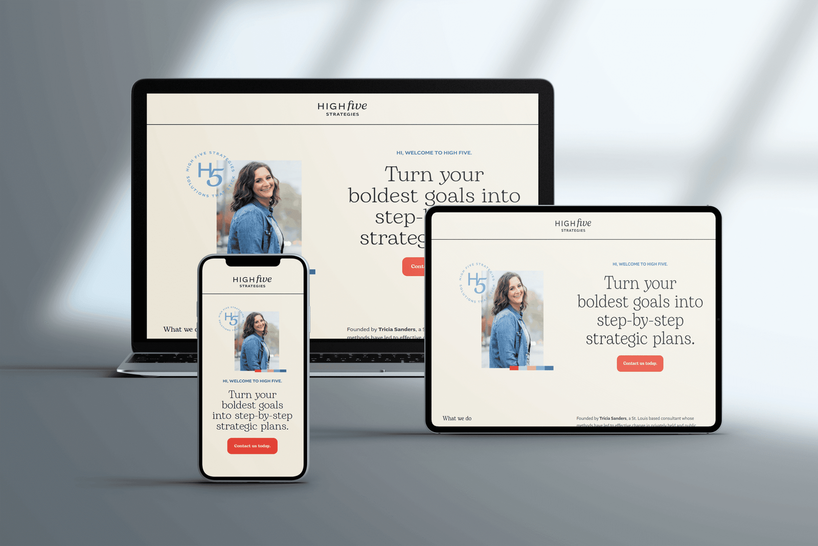
In today’s digital landscape, ensuring your website is accessible and user-friendly across various devices is paramount. Responsive web design (RWD) is the approach that allows websites to adapt seamlessly to different screen sizes and orientations, providing an optimal viewing experience for users on desktops, tablets, and mobile devices. This article delves into the principles and practices of creating a responsive website, offering insights and practical steps to guide you through the process.
Responsive web design is a methodology aimed at crafting websites that deliver an optimal viewing experience across a wide range of devices. This involves the use of flexible layouts, images, and cascading style sheet (CSS) media queries to adjust the site’s design and functionality based on the user’s device. The goal is to ensure ease of navigation and readability without the need for excessive resizing, panning, or scrolling.
Key principles of responsive design.
To implement responsive web design effectively, consider the following core principles:
1. Fluid grid layouts:
A fluid grid layout employs relative units like percentages instead of fixed units such as pixels to define the width of elements. This approach allows the layout to adjust proportionally to the screen size, maintaining consistency across different devices.
2. Flexible images and media:
Ensuring that images and media elements scale appropriately within their containing elements is crucial. This can be achieved by setting the media’s maximum width to 100%, allowing them to resize within the grid without overflowing.
3. Media Queries:
Media queries are a CSS feature that enables the application of specific styles based on the characteristics of the user’s device, such as screen width, height, and orientation. They are instrumental in creating responsive designs by allowing different layouts and styles to be applied under varying conditions.
Steps to create a responsive website.
Embarking on the journey to build a responsive website involves several critical steps:
1. Define the viewport:
<meta name="viewport" content="width=device-width, initial-scale=1.0">2. Implement a fluid grid system:
Design your layout using a fluid grid system where element widths are defined in relative units like percentages. This approach ensures that elements resize proportionally to the screen size. For instance, setting a container’s width to 80% allows it to adjust dynamically as the viewport changes.
3. Apply Media Queries:
@media screen and (max-width: 768px) {
  nav {
    display: none;
  }
  .menu-icon {
    display: block;
  }
}
4. Optimize images and media:
img {
  max-width: 100%;
  height: auto;
}
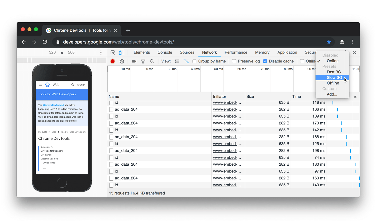
5. Test across multiple devices:
Regular testing on various devices and screen sizes is essential to ensure your website functions correctly and provides a consistent user experience. Utilize browser developer tools and responsive design testing tools to simulate different environments.
Best practices for responsive web design.
1. Mobile first approach:
Designing for mobile devices first ensures that the essential content and functionality are prioritized. This approach involves starting with a simple, linear layout and progressively enhancing it for larger screens.
2. Use of scalable vector graphics (SVGs):
SVGs are resolution-independent graphics that scale seamlessly across different screen sizes without losing quality, making them ideal for responsive designs.
3. Performance optimization:
Efficient loading times are crucial for user retention. Optimize your website’s performance by minifying CSS and JavaScript files, compressing images, and leveraging browser caching.
Conclusion.
Creating a responsive website is essential in today’s diverse digital environment. By embracing responsive web design principles, implementing fluid grids, flexible media, and media queries, and adhering to best practices, you can ensure your website delivers an optimal experience across all devices. Utilizing the right tools and frameworks further streamlines the development process, enabling you to build a site that is both functional and accessible to a broad audience.