Top Modern Web Design Examples to Inspire Your Next Project
Elevate Your Website with These Modern Design Examples Want a website that attracts customers and boosts your business? This list showcases 7 modern web design…
Elevate Your Website with These Modern Design Examples
Want a website that attracts customers and boosts your business? This list showcases 7 modern web design examples, including minimalist design, dark mode, microinteractions, neumorphism, 3D elements, asymmetrical layouts, and glassmorphism, to inspire your next web project. See how these modern web design examples create engaging user experiences and drive conversions. These concepts are crucial for making your site stand out and effectively reaching your target audience.
1. Minimalist Design
Minimalist web design, a prominent example of modern web design, embraces the “less is more” philosophy. By stripping away unnecessary elements and prioritizing essential content, this approach creates elegant and highly functional websites. Minimalist design emphasizes clean layouts, ample white space, simplified navigation, and a strategic use of color to deliver optimal user experiences across all devices. This results in websites that are fast-loading, easy to navigate, and aesthetically pleasing.
This design style is particularly effective for showcasing products or services in a clean, uncluttered manner. It allows the core message and value proposition to take center stage, free from distractions. Think of Apple.com, a benchmark for minimalist tech design. Its clean lines and focus on product imagery are a testament to the power of simplicity. Similarly, Squarespace.com uses a clean layout and bold typography to highlight its website building platform, appealing to design-conscious users. Dropbox.com exemplifies minimalist design with its simple, functional layout and strategic use of color, effectively communicating its file-sharing services. Even Airbnb.com, while incorporating visuals, maintains a minimalist aesthetic by focusing on high-quality images and clear calls to action. These modern web design examples demonstrate how minimalism can effectively serve a variety of businesses, from tech giants to hospitality platforms.
For small business owners, especially those in fields like real estate, restaurants, or home services, a minimalist design can be incredibly effective. Imagine a real estate website showcasing stunning property photos against a clean white background, or a restaurant website with a simple menu and online ordering system. This approach allows potential customers to quickly find the information they need without being overwhelmed. Learn more about Minimalist Design and how it can benefit your business.
Features of Minimalist Design:
Clean, spacious layouts with generous whitespace
Limited color palette (often monochromatic or with accent colors)
Typography-focused content presentation
Flat design elements without excessive shadows or gradients
Hidden or simplified navigation menus
Pros:
Faster page loading times due to fewer elements
Improved focus on core content and messaging
Easier responsive adaptation across devices
Timeless aesthetic that ages well
Better accessibility for users with cognitive disabilities
Cons:
Can appear too similar to other minimalist sites if not well-executed
May not work for content-heavy websites without careful planning
Requires skilled design to create distinction with limited elements
May not immediately engage users who prefer visual richness
Tips for Implementing Minimalist Design:
Emphasize negative space: Create focus on key elements by allowing them to breathe.
Use a grid system: Establish visual harmony and structure for a consistent user experience.
Limit your color palette: Stick to 2-3 colors maximum for a cohesive and impactful look.
Prioritize typography: Choose fonts that are clear, legible, and reflective of your brand.
Remove any element that doesn’t serve a clear purpose: Every element should contribute to the overall message and user experience.
Minimalist design, popularized by figures like Apple (under Jony Ive’s design leadership), the Swiss Design Movement, Dieter Rams, and even reflected in Google’s Material Design guidelines, remains a powerful approach in modern web design. Its focus on clarity, functionality, and timeless aesthetics makes it an ideal choice for businesses seeking a strong online presence that effectively communicates their core message and converts visitors into customers.
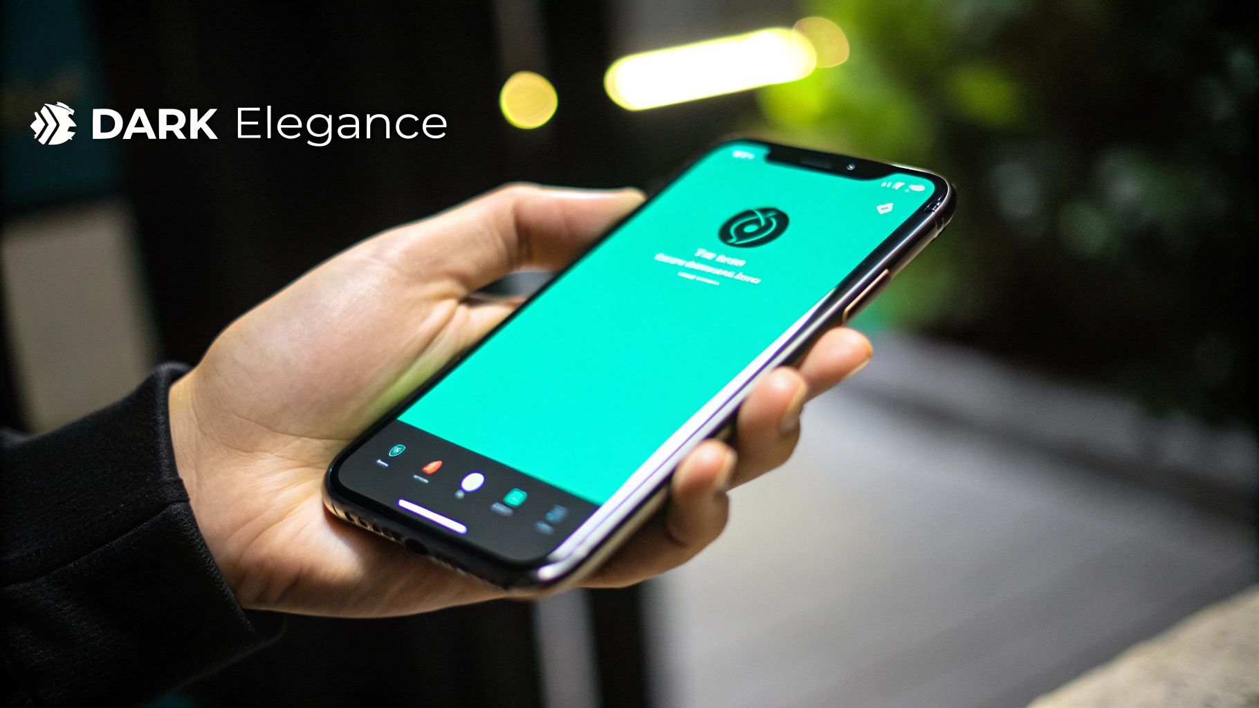
2. Dark Mode Design
Dark mode design is a modern web design example that has quickly gained popularity. It utilizes dark backgrounds (usually black, dark gray, or deep blues) with light-colored text and UI elements, creating high contrast and reducing light emission from screens. This design choice offers both aesthetic and functional benefits, making it a compelling option for various websites and applications. Originally popular among developers and in specialized applications, dark mode has transitioned into the mainstream for its stylish appearance, ability to reduce eye strain, and potential energy savings.
Dark mode’s core features include the use of dark backgrounds, typically in shades of black, dark gray, or deep blue. Light-colored text, usually white or off-white, ensures readability against these dark backdrops. Strategic use of accent colors highlights important UI elements, further improving navigation and user experience. This design prioritizes a high contrast between foreground (text and UI elements) and background elements for optimal visibility and readability. Most implementations also offer a toggle, allowing users to switch between light and dark modes based on their preference or environment.
This modern web design example offers several advantages. It reduces eye strain, particularly in low-light environments, a key benefit for users spending extended periods looking at screens. For devices with OLED or AMOLED screens, dark mode can also contribute to lower battery consumption as these displays illuminate individual pixels; darker pixels require less energy. Beyond the practical benefits, dark mode creates a sleek, modern, and often premium aesthetic that many users find appealing. It also allows colorful elements to pop more vibrantly, creating a visually engaging experience. Finally, dark mode supports users with light sensitivity conditions, making websites more accessible and inclusive.
However, dark mode isn’t without its drawbacks. It can sometimes reduce readability, especially for long-form content, making it essential to carefully consider font choices and sizing. Implementing dark mode effectively requires meticulous color selection to maintain accessibility standards, ensuring sufficient contrast between text and background. Adapting existing websites to incorporate a dark mode can also be challenging, requiring adjustments across all UI components. Finally, the dark aesthetic may not align with all brand identities, particularly those associated with brightness or vibrancy.
Several prominent websites have successfully implemented dark mode. Spotify, a pioneer in mainstream dark mode adoption, showcases its effectiveness for media-focused platforms. Netflix, another streaming giant, utilizes a dark interface optimized for immersive media consumption. GitHub, a platform frequented by developers, provides an example of excellent dark mode implementation in a coding-centric environment. Discord, a popular community platform, even uses dark mode as its default setting.
For those considering implementing dark mode, several tips can ensure a successful outcome. Avoid using pure black (#000000) for backgrounds; opt for slightly lighter off-blacks (e.g., #121212, #1A1A1A) to create a softer, less harsh look. Steer clear of high-saturation colors that can cause visual vibration against dark backgrounds. Rigorously test for sufficient contrast ratios (a minimum of 4.5:1 for regular text) to meet accessibility guidelines. Always consider providing both light and dark mode options to cater to user preferences. Finally, explore the use of subtle gradients to create depth and visual interest in dark interfaces.
Dark mode’s rise in popularity can be attributed to several factors, including its origins in developer coding environments and IDEs. Apple’s introduction of system-wide dark mode in macOS Mojave (2018) significantly contributed to its mainstream acceptance. Google followed suit with dark theme implementation in Android 10, further solidifying its presence. Social media platforms like Twitter, with its early “night mode” feature, also played a role in familiarizing users with the concept.
This modern web design example deserves its place on this list for its wide adoption, proven benefits for user experience, and its ability to create a modern, sophisticated aesthetic. Its increasing popularity, particularly among younger demographics and within specific industries, makes it a crucial design consideration for businesses seeking a contemporary online presence. From reducing eye strain and saving battery life to enhancing visual appeal, dark mode presents a powerful tool for creating engaging and user-friendly websites. This is particularly relevant for small businesses, e-commerce startups, and service providers looking to enhance their online brand and cater to a diverse audience.
3. Microinteractions: Small Details, Big Impact
Microinteractions are the subtle animations and feedback elements woven into a website’s interface that respond directly to user actions. These small, almost invisible moments enhance the user experience without overwhelming the overall design. Think of the gentle pulse of a button when you hover over it, the reassuring swish of a notification, or the dynamic progress bar that keeps you informed during a file upload. These are all examples of microinteractions working to create a more intuitive and engaging digital experience. They are crucial for modern web design examples as they elevate a website from functional to truly user-friendly.
Microinteractions employ visual, auditory, or even haptic (vibration) feedback mechanisms to guide user attention, confirm actions, and provide feedback. These purposeful motions not only enhance usability but also inject personality and reinforce brand identity. For small business owners, this can mean making a lasting impression on potential customers, building trust, and ultimately driving conversions. For real estate agents, a smooth, interactive gallery can captivate potential buyers. Restaurants can leverage microinteractions in their online ordering systems for a more user-friendly and enjoyable customer experience.
Features of Effective Microinteractions:
Subtle animations: Triggered by specific user actions, these animations are designed to be unobtrusive yet noticeable.
Multi-sensory feedback: Visual cues like color changes, auditory signals like clicks, or haptic feedback provide confirmation and guidance.
Purposeful motion: Every microinteraction should serve a clear purpose, guiding the user’s attention or providing feedback.
Contextual responses: The feedback should be relevant to the user’s action and the context of the interaction.
Personality-driven design: Microinteractions are an opportunity to inject brand personality and create memorable experiences.
Pros:
Enhanced UX: Provides immediate feedback, making interactions feel responsive and intuitive.
Perceived Performance Boost: Loading animations, for example, can make wait times seem shorter.
Intuitive Guidance: Microinteractions can seamlessly guide users through complex interfaces.
Added Delight: They add a layer of polish and personality to websites.
Reduced User Error: Confirmation microinteractions minimize mistakes and improve form completion rates.
Cons:
Distraction Potential: Overuse or poorly implemented microinteractions can be distracting.
Performance Impact: Unoptimized animations can increase page load times.
JavaScript Dependency: Reliance on JavaScript can affect users with disabled scripts.
Accessibility Concerns: Improper implementation can create accessibility issues.
Examples in Action:
Google.com: The subtle animation when clicking the microphone icon in the search bar.
Stripe.com: Smooth transitions and elegant button hover states.
Pinterest.com: Loading animations and infinite scroll interactions.
Mailchimp.com: Form validation microinteractions and feedback messages.
Tips for Implementation:
Keep it brief: Aim for animations under 0.4 seconds for optimal perception.
Prioritize function: Ensure every microinteraction serves a clear purpose.
Follow animation principles: Use the 12 principles of animation for natural-feeling motion.
Test thoroughly: Test microinteractions on various devices and connection speeds.
Accessibility first: Provide alternatives for users with reduced motion preferences.
Key Influencers:
Dan Saffer (author of Microinteractions: Designing with Details), Google’s Material Design motion guidelines, and Apple’s Human Interface Guidelines have all played significant roles in popularizing and refining the use of microinteractions in modern web design.
By thoughtfully implementing microinteractions, businesses of all sizes, from e-commerce startups to local nonprofits, can create more engaging and user-friendly online experiences. This translates to improved customer satisfaction, increased conversions, and a stronger online presence. Microinteractions demonstrate a commitment to detail and user-centric design, a vital component of modern web design examples that resonates with today’s digitally savvy audience.
4. Neumorphism
Neumorphism, also known as new skeuomorphism, is a modern web design trend that walks a fine line between flat design and realism. It aims to create a soft, extruded user interface where elements appear to protrude from or be pressed into the background. This tactile effect is achieved through the clever use of subtle shadows and highlights, creating an almost physical feel without resorting to heavy ornamentation. Neumorphism prioritizes a clean and modern aesthetic, offering a fresh alternative to purely flat design while still maintaining a sense of minimalism. This approach helps create a visually appealing and engaging user experience, making interfaces feel more interactive and intuitive.
Key features of neumorphism include soft shadows that create subtle extrusion effects, monochromatic color schemes with limited contrast, rounded corners and soft edges on elements, and subtle gradients that mimic light falling on physical objects. These features combine to give elements the appearance of being either pressed into or popping out from the background, creating a sense of depth and dimension.
Neumorphism can be a powerful tool for modern web design examples, especially for interactive elements like buttons and sliders, where the tactile illusion can enhance usability. Websites and apps like Apple Music (applemusic.apple.com), Revolut (revolut.com), Finder (finder.com), and Sketch (sketchapp.com) have incorporated neumorphic elements into their user interfaces, showcasing the style’s versatility across different industries. This visual style can be particularly appealing to small business owners, e-commerce startups, and local businesses looking for a modern and engaging online presence that stands out from the crowd. The soft, approachable aesthetics also resonate well with service businesses, healthcare providers, and non-profits seeking to create a trustworthy and user-friendly experience.
Pros of Neumorphism:
Creates visually appealing, tactile interfaces.
Offers a fresh, modern alternative to flat design.
Provides subtle depth cues without being overly decorative.
Can create a cohesive and unified visual system.
Enhances interactive elements like buttons and sliders.
Cons of Neumorphism:
Can present accessibility challenges due to limited contrast.
Can be difficult to implement responsively across different devices.
May lead to usability issues if interactive elements are hard to discern.
Limits color palette options due to the reliance on subtle shadowing.
Can become dated quickly due to its trendy nature.
Tips for Implementing Neumorphism:
Subtlety is Key: Use soft shadows (2-4px blur) with low opacity (10-20%).
Prioritize Accessibility: Ensure sufficient color contrast for readability and usability.
Enhance Tactility: Combine neumorphism with microinteractions for a more engaging experience.
Test Thoroughly: Preview your design in various lighting conditions to ensure visual clarity.
Selective Application: Consider using neumorphism for specific elements rather than across the entire interface.
Neumorphism deserves its place among modern web design examples because it offers a distinct aesthetic that can create a memorable user experience. While it’s essential to be mindful of the potential drawbacks, particularly concerning accessibility, when implemented thoughtfully and strategically, neumorphism can effectively enhance the visual appeal and interactivity of your website. By following the tips outlined above, you can leverage this trend to create a modern and engaging online presence for your business.
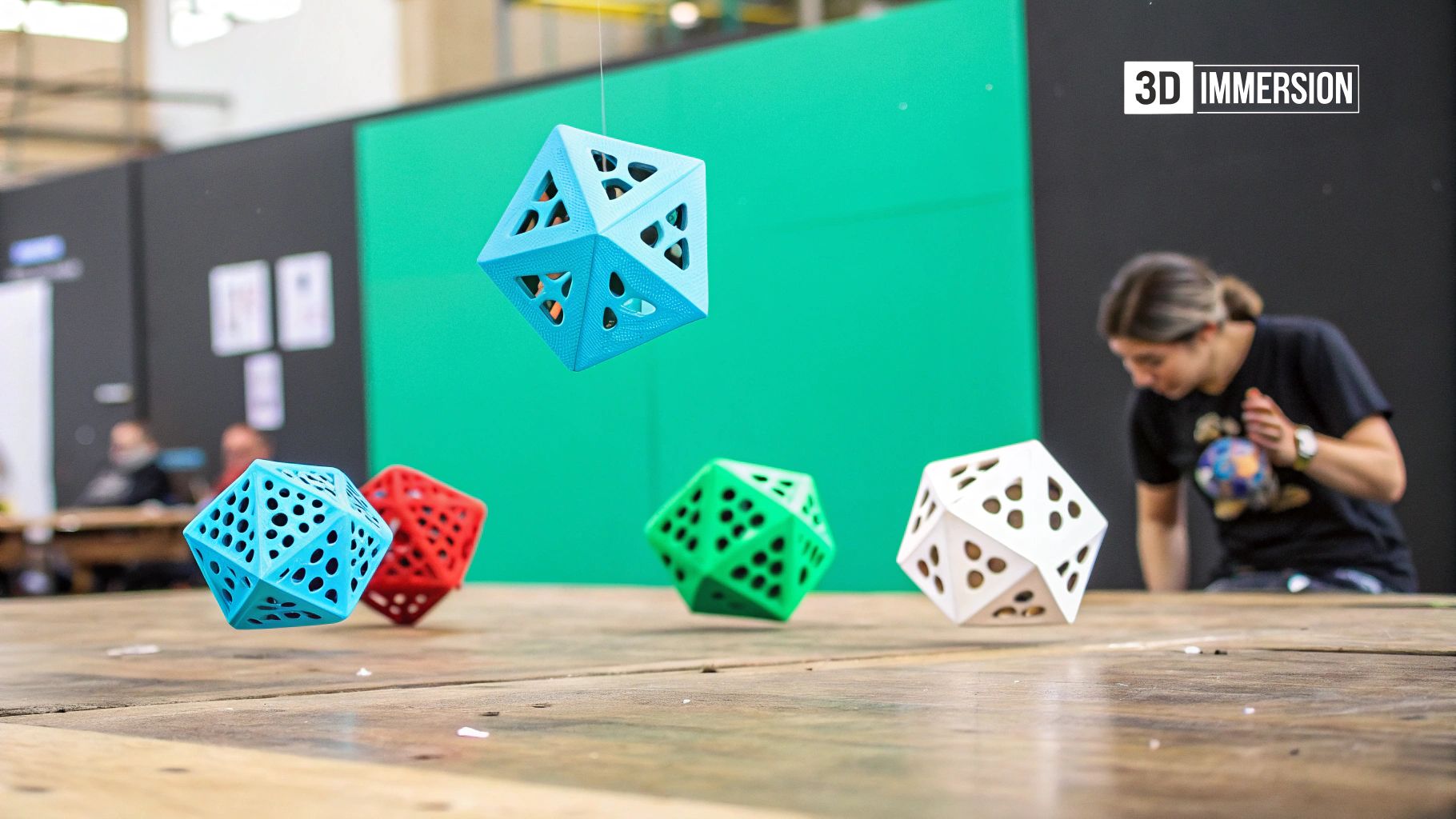
5. 3D Elements and Illustrations
3D elements and illustrations are transforming the landscape of modern web design examples, offering a captivating way to engage users and elevate a website’s aesthetic appeal. This approach incorporates three-dimensional graphics, renderings, and animations to create depth and visual interest, moving beyond the limitations of traditional flat designs. By leveraging perspective, lighting, and dimension, 3D elements can showcase products, explain complex concepts, or simply provide a visually delightful experience. This makes 3D elements a powerful tool for businesses aiming to stand out in a crowded digital space, whether you’re a small business owner, a real estate agent, or an e-commerce startup.
This trend isn’t just about eye-catching visuals; it’s about creating immersive experiences. Interactive 3D elements that respond to user input, combined with parallax effects that create spatial relationships, offer a level of engagement not possible with 2D design. Imagine exploring a product from all angles with a simple click or visualizing a complex data set in a dynamic, interactive 3D environment. These features are especially relevant for businesses showcasing physical products, like e-commerce startups or real estate agencies presenting properties. For instance, realistic 3D renderings of products or characters allow users to experience them in a virtual environment before making a purchase, ultimately fostering trust and confidence.
Examples of successful implementations of 3D elements abound in modern web design. Apple’s product pages (Apple.com/airpods, for example) utilize stunning 3D product visualizations, allowing users to explore the intricacies of their devices in a highly realistic manner. Many award-winning websites featured on Awwwards.com also showcase innovative uses of 3D. Bruno Simon’s portfolio website (Bruno-simon.com) offers an incredibly immersive and interactive 3D experience, showcasing the potential of this technology for creative professionals. Even companies like Stripe (Stripe.com) incorporate abstract 3D elements seamlessly into their brand identity, adding a touch of sophistication and modernity.
Features of 3D Web Design:
Dimensional objects with perspective and depth
Realistic or stylized 3D renderings of products or characters
Interactive 3D elements that respond to user input
Parallax effects creating spatial relationships
WebGL and Three.js implementations for complex 3D scenes
Pros:
Creates visually distinctive and memorable experiences
Effectively showcases physical products from multiple angles
Engages users with interactive elements not possible in 2D
Can explain complex concepts through spatial visualization
Demonstrates technical sophistication and brand innovation
Cons:
Often increases page load times significantly
May not work well on older devices or slower connections
Requires specialized skills and tools to create and implement
Can be distracting if not purposefully integrated
May pose accessibility challenges for some users
Tips for Implementing 3D Elements:
Optimize 3D assets for web: Minimize file sizes to ensure fast loading times.
Provide fallbacks: Offer alternative 2D content for devices that can’t handle complex 3D.
Selective integration: Consider using 3D selectively for key elements rather than entire interfaces.
Content-focused design: Ensure 3D elements support your content rather than distract from it.
Thorough testing: Test performance across various devices and connection speeds.
The rise of 3D elements in web design is driven by advancements in technology, particularly the increasing accessibility of WebGL and the powerful Three.js JavaScript library. Design agencies like Active Theory and many Awwwards winners have been instrumental in pushing the boundaries of 3D web experiences. Learn more about 3D Elements and Illustrations to discover how these powerful tools can enhance your website.
When considering whether to incorporate 3D elements into your web design, remember to prioritize user experience. While the visual appeal is undeniable, it’s crucial to ensure that the 3D elements enhance, rather than detract from, the overall functionality and usability of your site. By following the tips above and focusing on purposeful integration, you can leverage the power of 3D to create a truly modern and memorable web experience that resonates with your target audience, from local small business owners and non-profit organizations to healthcare providers and service business owners.
6. Asymmetrical Layouts
Asymmetrical layouts represent a significant trend in modern web design examples, offering a dynamic and engaging alternative to traditional grid-based structures. By intentionally distributing elements unevenly across the page, this approach creates visual interest and a distinct brand identity. Instead of relying on symmetry, asymmetrical designs leverage visual weight and strategic placement to guide the user’s eye, resulting in websites that feel both modern and artistic while maintaining usability. This technique is particularly effective for businesses seeking to stand out from the competition with a unique online presence, appealing to audiences who appreciate cutting-edge design. Think of it as a carefully orchestrated imbalance, where different elements, like varied column widths and overlapping images, work together to create a harmonious whole.
This approach is particularly effective for small business owners, real estate agents, restaurant owners, entrepreneurs, e-commerce startups, home service businesses, local nonprofits, healthcare providers, and really any local business owner looking for a unique and engaging website. It can help these businesses establish a strong brand identity and differentiate themselves in a crowded online marketplace.
How it Works:
Asymmetrical layouts achieve their effect through several key features:
Uneven Distribution of Elements: Content is arranged off-center, creating a sense of movement and dynamism.
Varied Column Widths and Element Sizes: Playing with different sizes and proportions adds to the visual interest.
Strategic Use of Negative Space: White space is used purposefully to balance the asymmetry and prevent the design from feeling cluttered.
Overlapping Elements: Layering elements adds depth and visual complexity.
Unexpected Element Positioning: Breaking free from the constraints of traditional grids allows for surprising and engaging placements.
Examples of Successful Implementation:
Seedlip (seedlipdrinks.com): This non-alcoholic spirits brand uses asymmetry to showcase its artistic branding.
Pentagram (pentagram.com): The renowned design agency’s website features overlapping asymmetrical elements, demonstrating the technique’s effectiveness in a professional context.
Bauhaus-movement.com: A site inspired by the art movement that pioneered asymmetry in design.
Awwwards.com: Browsing the winners of this prestigious web design award will reveal numerous innovative uses of asymmetrical layouts.
Pros:
Visual Interest and Distinctive Brand Identity: Asymmetry immediately grabs attention and helps establish a unique online presence.
Effective Direction of User Attention: Strategic placement guides users through the content hierarchy.
Creative Flexibility: Unlike rigid grids, asymmetry allows for greater freedom in design choices.
Adaptability to Varied Content Types: Asymmetrical layouts can accommodate diverse content formats more naturally.
Modern and Sophisticated Aesthetic: Asymmetry adds a touch of artistry and elegance.
Cons:
Increased Design Complexity: Creating and maintaining asymmetrical layouts can be more challenging than traditional grids.
Responsiveness Challenges: Ensuring the layout adapts seamlessly across different devices requires careful planning.
Potential for User Confusion: Poorly executed asymmetry can be disorienting for users accustomed to conventional layouts.
Need for Strong Design Skills: Achieving visual harmony with asymmetry demands expertise.
Readability Concerns: Care must be taken to avoid compromising readability with unconventional element placement.
Tips for Implementation:
Balance through Visual Weight: Use color, size, and contrast to create a sense of equilibrium despite the asymmetry.
Loose Grid System: Start with a basic grid and then strategically break away from it to introduce asymmetrical elements.
Maintain Clear Visual Hierarchy: Ensure users can easily understand the order of importance for different content elements.
Test Responsiveness: Thoroughly test the layout on various screen sizes to ensure a consistent user experience. Learn more about Asymmetrical Layouts and responsive website design.
Purposeful Asymmetry: Use the technique intentionally to guide users through the content and achieve specific design goals.
When and Why to Use Asymmetry:
Asymmetrical layouts are ideal for businesses wanting to project a modern, creative, and sophisticated image. They are particularly effective for portfolios, online magazines, and websites showcasing visual content. If your goal is to stand out from the crowd and create a memorable user experience, asymmetry can be a powerful tool. Its ability to highlight key elements and guide user attention makes it especially beneficial for calls to action and showcasing specific products or services. While it requires more design expertise, the payoff can be significant in terms of brand differentiation and user engagement. This makes it an excellent choice for modern web design examples, particularly those targeting design-conscious audiences or operating in visually driven industries. Popularized by design movements like Bauhaus and the Swiss/International Style, asymmetry is now a mainstay in digital adaptations of magazine and editorial layouts, demonstrating its continued relevance in modern web design.
7. Glassmorphism: A Translucent Touch of Modernity
Glassmorphism is a captivating modern web design example that adds a touch of sleek sophistication to any website. This trend, characterized by its frosted glass-like appearance, can elevate your site’s aesthetic and provide a unique user experience. It achieves this effect through the use of blurred backgrounds seen through semi-transparent UI elements, creating an illusion of depth and layering that makes elements appear to float. This technique offers a modern, light aesthetic that works exceptionally well with vibrant backgrounds and gradients, making it a valuable tool in contemporary web design. This makes it a worthy addition to our list of modern web design examples, especially for businesses looking to project a cutting-edge image.
For small business owners, real estate agents, restaurant owners, entrepreneurs, and local businesses aiming for a modern and visually appealing website, glassmorphism can be a powerful differentiator. Its clean, contemporary look can make your brand stand out and attract attention. Whether you’re an e-commerce startup, a home service business, a local nonprofit, or a healthcare provider, glassmorphism can enhance your online presence and create a memorable user experience.
How Glassmorphism Works:
The core of glassmorphism lies in the clever use of CSS properties like backdrop-filter: blur(). This blurs the content behind an element, simulating the look of frosted glass. Combined with a subtle transparency, typically around 60% opacity, it allows background elements to partially show through, adding depth and visual interest. Thin, light borders further enhance the definition of each element, preventing the design from appearing too washed out. Multiple translucent layers can be stacked to create even greater depth and a more complex visual hierarchy.
Features and Benefits:
Depth and Dimension: Glassmorphism adds a sense of depth and dimension without relying on heavy shadows, creating a lighter and more airy feel.
Modern and Sleek Aesthetic: The translucent elements provide a fresh, contemporary look that can modernize any website.
Versatility with Light and Dark Modes: Glassmorphism adapts well to both light and dark mode color schemes, maintaining its visual appeal.
Background Integration: By allowing background elements to remain partially visible, glassmorphism creates a more cohesive and integrated design.
Pros:
Creates depth and dimension without heavy shadows.
Provides a modern, sleek aesthetic.
Works well with light and dark modes.
Allows background elements to remain partially visible.
Can make interfaces feel lighter and more airy.
Cons:
Not fully supported in all browsers (especially older versions). Consider fallbacks.
Can cause performance issues on lower-end devices if overused.
May create legibility problems if not implemented carefully (ensure sufficient contrast).
Requires careful color management for optimal readability.
May feel trendy and could become dated quickly.
Examples of Successful Implementation:
Apple.com (macOS and iOS interfaces): Apple has been a pioneer of modern glassmorphism, using it extensively in their operating system interfaces.
Microsoft.com (Windows 11 interface): Microsoft also incorporates glassmorphic elements in their Windows 11 design.
Stripe.com (Payment forms): Stripe utilizes subtle glass effects to enhance the visual appeal of their payment forms.
Glassmorphism.com: This website serves as a dedicated showcase for the glassmorphism design trend.
Tips for Implementing Glassmorphism:
Browser Compatibility: Use backdrop-filter: blur() with fallbacks for older browsers that lack support.
Readability: Maintain at least 60% opacity for the glassmorphic elements to ensure sufficient contrast and readability.
Defined Boundaries: Add subtle borders (1-2px) to clearly define element boundaries and prevent the design from looking blurry.
Background Testing: Test your glassmorphic elements against various backgrounds to ensure content remains legible in all scenarios.
Sparing Use: Use glassmorphism strategically for key interface elements rather than applying it to every component. Overuse can diminish its impact and lead to performance issues.
Origins and Popularization:
While blurred effects were introduced by Apple in iOS 7 (2013), the term “Glassmorphism” and the specific aesthetic we recognize today were popularized by UI designer Michal Malewicz in 2020. Microsoft’s Fluent Design System further contributed to its adoption, and designer communities on platforms like Dribbble and Behance have embraced and explored its potential.
By following these tips and understanding the potential drawbacks, you can leverage glassmorphism effectively to create a modern and engaging web design that sets your business apart. It’s a powerful tool in the modern web designer’s arsenal, particularly for those catering to a forward-thinking audience. Remember that its effective use hinges on careful implementation and a keen eye for detail, ensuring both aesthetics and functionality work in harmony.
Design Feature Comparison of 7 Modern Websites
Design Style
Implementation Complexity
Resource Requirements
Expected Outcomes
Ideal Use Cases
Key Advantages
Minimalist Design
Low to Medium; requires skilled design to maintain uniqueness
Medium; requires backdrop-filter use and careful styling
Medium; potential performance impact on devices
Modern, sleek UI with depth and translucency
Modern apps, dashboards, sites using layered colorful backgrounds
Depth without heavy shadows, airy, works in light/dark modes
Ready to Modernize Your Web Design?
From minimalist design and dark mode to the immersive experiences of 3D elements and the sleek aesthetics of glassmorphism, the modern web design examples explored in this article offer a wealth of inspiration. We’ve highlighted key trends like microinteractions, neumorphism, and asymmetrical layouts, showcasing how these elements can elevate user engagement and create a truly memorable online experience. Mastering these approaches is crucial for staying competitive in today’s digital landscape. A modern, well-designed website not only attracts visitors but also builds trust, enhances brand identity, and ultimately drives conversions, regardless of whether you’re a small business owner, a real estate agent, a restaurateur, or an entrepreneur launching a startup.
Once you’ve explored these inspiring web design examples, showcasing your own work becomes the next step. Building a strong online presence is crucial for designers, and a well-crafted portfolio is key to attracting clients and opportunities. For inspiration and guidance, check out these best creative portfolio websites highlighted by Creativize in their article “Top 10 Creative Portfolio Websites to Showcase Your Work in 2025.”
A modern web design is an investment in your future success. It’s about creating a digital storefront that reflects your brand’s personality and resonates with your target audience. Ready to bring your vision to life with a cutting-edge website that incorporates these modern design trends? Contact Swish Web Designs today. Our team specializes in creating stunning, high-performing websites that are tailored to your unique needs and incorporate the latest design trends, helping you stand out from the competition.
 This design style is particularly effective for showcasing products or services in a clean, uncluttered manner. It allows the core message and value proposition to take center stage, free from distractions. Think of Apple.com, a benchmark for minimalist tech design. Its clean lines and focus on product imagery are a testament to the power of simplicity. Similarly, Squarespace.com uses a clean layout and bold typography to highlight its website building platform, appealing to design-conscious users. Dropbox.com exemplifies minimalist design with its simple, functional layout and strategic use of color, effectively communicating its file-sharing services. Even Airbnb.com, while incorporating visuals, maintains a minimalist aesthetic by focusing on high-quality images and clear calls to action. These modern web design examples demonstrate how minimalism can effectively serve a variety of businesses, from tech giants to hospitality platforms.
For small business owners, especially those in fields like real estate, restaurants, or home services, a minimalist design can be incredibly effective. Imagine a real estate website showcasing stunning property photos against a clean white background, or a restaurant website with a simple menu and online ordering system. This approach allows potential customers to quickly find the information they need without being overwhelmed. Learn more about Minimalist Design and how it can benefit your business.
Features of Minimalist Design:
This design style is particularly effective for showcasing products or services in a clean, uncluttered manner. It allows the core message and value proposition to take center stage, free from distractions. Think of Apple.com, a benchmark for minimalist tech design. Its clean lines and focus on product imagery are a testament to the power of simplicity. Similarly, Squarespace.com uses a clean layout and bold typography to highlight its website building platform, appealing to design-conscious users. Dropbox.com exemplifies minimalist design with its simple, functional layout and strategic use of color, effectively communicating its file-sharing services. Even Airbnb.com, while incorporating visuals, maintains a minimalist aesthetic by focusing on high-quality images and clear calls to action. These modern web design examples demonstrate how minimalism can effectively serve a variety of businesses, from tech giants to hospitality platforms.
For small business owners, especially those in fields like real estate, restaurants, or home services, a minimalist design can be incredibly effective. Imagine a real estate website showcasing stunning property photos against a clean white background, or a restaurant website with a simple menu and online ordering system. This approach allows potential customers to quickly find the information they need without being overwhelmed. Learn more about Minimalist Design and how it can benefit your business.
Features of Minimalist Design:
 Dark mode’s core features include the use of dark backgrounds, typically in shades of black, dark gray, or deep blue. Light-colored text, usually white or off-white, ensures readability against these dark backdrops. Strategic use of accent colors highlights important UI elements, further improving navigation and user experience. This design prioritizes a high contrast between foreground (text and UI elements) and background elements for optimal visibility and readability. Most implementations also offer a toggle, allowing users to switch between light and dark modes based on their preference or environment.
This modern web design example offers several advantages. It reduces eye strain, particularly in low-light environments, a key benefit for users spending extended periods looking at screens. For devices with OLED or AMOLED screens, dark mode can also contribute to lower battery consumption as these displays illuminate individual pixels; darker pixels require less energy. Beyond the practical benefits, dark mode creates a sleek, modern, and often premium aesthetic that many users find appealing. It also allows colorful elements to pop more vibrantly, creating a visually engaging experience. Finally, dark mode supports users with light sensitivity conditions, making websites more accessible and inclusive.
However, dark mode isn’t without its drawbacks. It can sometimes reduce readability, especially for long-form content, making it essential to carefully consider font choices and sizing. Implementing dark mode effectively requires meticulous color selection to maintain accessibility standards, ensuring sufficient contrast between text and background. Adapting existing websites to incorporate a dark mode can also be challenging, requiring adjustments across all UI components. Finally, the dark aesthetic may not align with all brand identities, particularly those associated with brightness or vibrancy.
Several prominent websites have successfully implemented dark mode. Spotify, a pioneer in mainstream dark mode adoption, showcases its effectiveness for media-focused platforms. Netflix, another streaming giant, utilizes a dark interface optimized for immersive media consumption. GitHub, a platform frequented by developers, provides an example of excellent dark mode implementation in a coding-centric environment. Discord, a popular community platform, even uses dark mode as its default setting.
For those considering implementing dark mode, several tips can ensure a successful outcome. Avoid using pure black (#000000) for backgrounds; opt for slightly lighter off-blacks (e.g., #121212, #1A1A1A) to create a softer, less harsh look. Steer clear of high-saturation colors that can cause visual vibration against dark backgrounds. Rigorously test for sufficient contrast ratios (a minimum of 4.5:1 for regular text) to meet accessibility guidelines. Always consider providing both light and dark mode options to cater to user preferences. Finally, explore the use of subtle gradients to create depth and visual interest in dark interfaces.
Dark mode’s rise in popularity can be attributed to several factors, including its origins in developer coding environments and IDEs. Apple’s introduction of system-wide dark mode in macOS Mojave (2018) significantly contributed to its mainstream acceptance. Google followed suit with dark theme implementation in Android 10, further solidifying its presence. Social media platforms like Twitter, with its early “night mode” feature, also played a role in familiarizing users with the concept.
This modern web design example deserves its place on this list for its wide adoption, proven benefits for user experience, and its ability to create a modern, sophisticated aesthetic. Its increasing popularity, particularly among younger demographics and within specific industries, makes it a crucial design consideration for businesses seeking a contemporary online presence. From reducing eye strain and saving battery life to enhancing visual appeal, dark mode presents a powerful tool for creating engaging and user-friendly websites. This is particularly relevant for small businesses, e-commerce startups, and service providers looking to enhance their online brand and cater to a diverse audience.
Dark mode’s core features include the use of dark backgrounds, typically in shades of black, dark gray, or deep blue. Light-colored text, usually white or off-white, ensures readability against these dark backdrops. Strategic use of accent colors highlights important UI elements, further improving navigation and user experience. This design prioritizes a high contrast between foreground (text and UI elements) and background elements for optimal visibility and readability. Most implementations also offer a toggle, allowing users to switch between light and dark modes based on their preference or environment.
This modern web design example offers several advantages. It reduces eye strain, particularly in low-light environments, a key benefit for users spending extended periods looking at screens. For devices with OLED or AMOLED screens, dark mode can also contribute to lower battery consumption as these displays illuminate individual pixels; darker pixels require less energy. Beyond the practical benefits, dark mode creates a sleek, modern, and often premium aesthetic that many users find appealing. It also allows colorful elements to pop more vibrantly, creating a visually engaging experience. Finally, dark mode supports users with light sensitivity conditions, making websites more accessible and inclusive.
However, dark mode isn’t without its drawbacks. It can sometimes reduce readability, especially for long-form content, making it essential to carefully consider font choices and sizing. Implementing dark mode effectively requires meticulous color selection to maintain accessibility standards, ensuring sufficient contrast between text and background. Adapting existing websites to incorporate a dark mode can also be challenging, requiring adjustments across all UI components. Finally, the dark aesthetic may not align with all brand identities, particularly those associated with brightness or vibrancy.
Several prominent websites have successfully implemented dark mode. Spotify, a pioneer in mainstream dark mode adoption, showcases its effectiveness for media-focused platforms. Netflix, another streaming giant, utilizes a dark interface optimized for immersive media consumption. GitHub, a platform frequented by developers, provides an example of excellent dark mode implementation in a coding-centric environment. Discord, a popular community platform, even uses dark mode as its default setting.
For those considering implementing dark mode, several tips can ensure a successful outcome. Avoid using pure black (#000000) for backgrounds; opt for slightly lighter off-blacks (e.g., #121212, #1A1A1A) to create a softer, less harsh look. Steer clear of high-saturation colors that can cause visual vibration against dark backgrounds. Rigorously test for sufficient contrast ratios (a minimum of 4.5:1 for regular text) to meet accessibility guidelines. Always consider providing both light and dark mode options to cater to user preferences. Finally, explore the use of subtle gradients to create depth and visual interest in dark interfaces.
Dark mode’s rise in popularity can be attributed to several factors, including its origins in developer coding environments and IDEs. Apple’s introduction of system-wide dark mode in macOS Mojave (2018) significantly contributed to its mainstream acceptance. Google followed suit with dark theme implementation in Android 10, further solidifying its presence. Social media platforms like Twitter, with its early “night mode” feature, also played a role in familiarizing users with the concept.
This modern web design example deserves its place on this list for its wide adoption, proven benefits for user experience, and its ability to create a modern, sophisticated aesthetic. Its increasing popularity, particularly among younger demographics and within specific industries, makes it a crucial design consideration for businesses seeking a contemporary online presence. From reducing eye strain and saving battery life to enhancing visual appeal, dark mode presents a powerful tool for creating engaging and user-friendly websites. This is particularly relevant for small businesses, e-commerce startups, and service providers looking to enhance their online brand and cater to a diverse audience.
 Microinteractions employ visual, auditory, or even haptic (vibration) feedback mechanisms to guide user attention, confirm actions, and provide feedback. These purposeful motions not only enhance usability but also inject personality and reinforce brand identity. For small business owners, this can mean making a lasting impression on potential customers, building trust, and ultimately driving conversions. For real estate agents, a smooth, interactive gallery can captivate potential buyers. Restaurants can leverage microinteractions in their online ordering systems for a more user-friendly and enjoyable customer experience.
Features of Effective Microinteractions:
Microinteractions employ visual, auditory, or even haptic (vibration) feedback mechanisms to guide user attention, confirm actions, and provide feedback. These purposeful motions not only enhance usability but also inject personality and reinforce brand identity. For small business owners, this can mean making a lasting impression on potential customers, building trust, and ultimately driving conversions. For real estate agents, a smooth, interactive gallery can captivate potential buyers. Restaurants can leverage microinteractions in their online ordering systems for a more user-friendly and enjoyable customer experience.
Features of Effective Microinteractions:
 Key features of neumorphism include soft shadows that create subtle extrusion effects, monochromatic color schemes with limited contrast, rounded corners and soft edges on elements, and subtle gradients that mimic light falling on physical objects. These features combine to give elements the appearance of being either pressed into or popping out from the background, creating a sense of depth and dimension.
Neumorphism can be a powerful tool for modern web design examples, especially for interactive elements like buttons and sliders, where the tactile illusion can enhance usability. Websites and apps like Apple Music (applemusic.apple.com), Revolut (revolut.com), Finder (finder.com), and Sketch (sketchapp.com) have incorporated neumorphic elements into their user interfaces, showcasing the style’s versatility across different industries. This visual style can be particularly appealing to small business owners, e-commerce startups, and local businesses looking for a modern and engaging online presence that stands out from the crowd. The soft, approachable aesthetics also resonate well with service businesses, healthcare providers, and non-profits seeking to create a trustworthy and user-friendly experience.
Pros of Neumorphism:
Key features of neumorphism include soft shadows that create subtle extrusion effects, monochromatic color schemes with limited contrast, rounded corners and soft edges on elements, and subtle gradients that mimic light falling on physical objects. These features combine to give elements the appearance of being either pressed into or popping out from the background, creating a sense of depth and dimension.
Neumorphism can be a powerful tool for modern web design examples, especially for interactive elements like buttons and sliders, where the tactile illusion can enhance usability. Websites and apps like Apple Music (applemusic.apple.com), Revolut (revolut.com), Finder (finder.com), and Sketch (sketchapp.com) have incorporated neumorphic elements into their user interfaces, showcasing the style’s versatility across different industries. This visual style can be particularly appealing to small business owners, e-commerce startups, and local businesses looking for a modern and engaging online presence that stands out from the crowd. The soft, approachable aesthetics also resonate well with service businesses, healthcare providers, and non-profits seeking to create a trustworthy and user-friendly experience.
Pros of Neumorphism: