Building a Better Website in 2025
This listicle presents seven web design best practices to elevate your online presence and achieve your business goals. Learn how to build a website that not only attracts visitors but also converts them into customers. These web design best practices cover key areas like responsive design, intuitive navigation, performance optimization, accessibility, content strategy, visual hierarchy, and user-centered design. Applying these principles is essential for a successful online presence, Whether you’re a Kingsport small business owner, Johnson City plumber, a Bristol-based e-commerce startup, or any other business.
1. Responsive Web Design
In today’s digital landscape, users access websites from a multitude of devices, ranging from large desktop monitors to smartphones and tablets. Ensuring your website delivers a consistent and user-friendly experience across all these platforms is paramount for success. This is where responsive web design (RWD), a cornerstone of modern web design best practices, becomes essential. RWD is an approach that allows web pages to adapt seamlessly to different screen sizes and resolutions, providing an optimal viewing experience regardless of the device used. It achieves this by utilizing HTML and CSS to dynamically adjust the layout, content size, and positioning based on the user’s viewport.
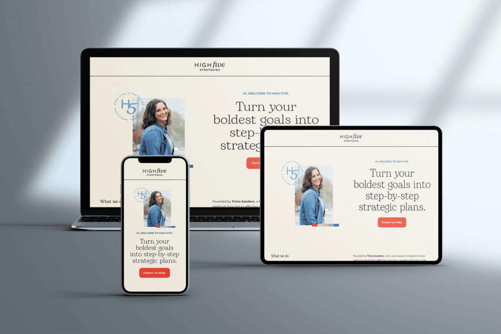
RWD relies on several key features: fluid grid layouts using percentages instead of fixed pixel values, flexible images and media that scale proportionally, and CSS media queries that apply specific styles based on device characteristics. This eliminates the need for separate websites for different devices, using a single codebase to serve all users. This approach drastically simplifies website maintenance and updates. Learn more about Responsive Web Design to understand the technical intricacies involved.
The benefits of embracing RWD for small business owners, real estate agents, restaurant owners, e-commerce startups, and anyone seeking a strong online presence are numerous. It leads to a significantly improved user experience across all devices, boosting engagement and conversion rates. Moreover, Google prioritizes mobile-friendly websites, making RWD crucial for better SEO performance. Using a single codebase also reduces development and maintenance costs. Finally, RWD is a future-proof solution, automatically adapting to new device sizes and resolutions as they emerge.
While RWD offers many advantages, there are a few potential drawbacks to consider. Implementing RWD for highly complex layouts can be challenging and may require extensive testing across various devices. Loading times can also be affected if the website isn’t properly optimized, potentially impacting user experience. Occasionally, certain advanced features might necessitate device-specific solutions.
Examples of successful RWD implementation abound, showcasing its effectiveness. Apple.com seamlessly adapts its elegant design from desktop to mobile, while Dropbox.com maintains full functionality across all screen sizes. The Guardian, known for its rich content, expertly transforms its complex layout to fit various devices. These examples highlight how RWD can be applied across diverse industries and content types.
Creating a responsive website is crucial for reaching users across various devices. To delve deeper into building adaptable and user-friendly websites, explore these responsive design best practices from Bookmarkify. Here are some actionable tips to get you started with RWD: adopt a mobile-first approach, prioritizing the design for smaller screens; utilize relative units (%, em, rem) instead of fixed units (px) for flexibility; test your website on real devices, not just browser emulators, to ensure accurate rendering; and implement breakpoints based on your content’s needs rather than specific device types.
By prioritizing responsive web design as a core element of your web design best practices, you can create a website that not only looks great but also performs optimally, reaching a wider audience and driving better results in the increasingly mobile-centric digital world.
2. Intuitive Navigation Design
Intuitive navigation design is a cornerstone of effective web design best practices. It focuses on creating a website navigation system that is effortless for users to understand and use. Visitors should be able to find the information they need quickly and without confusion, regardless of their technical skills or familiarity with your website. This involves structuring your website’s content in a logical and predictable manner, using clear visual cues, and employing consistent design patterns that align with users’ expectations. A well-designed navigation system minimizes the cognitive load on users, allowing them to focus on the content and achieve their goals efficiently.

Intuitive navigation design encompasses several key features. These include clear menu structures with logical grouping of related items, consistent placement of navigation elements throughout the site, and a visual hierarchy that guides users to important content. For complex websites, breadcrumb trails provide context and allow users to easily backtrack. A robust search functionality empowers users to directly access specific information. These elements work together to create a seamless and user-friendly experience.
This approach is crucial for any business seeking a strong online presence, from small local shops to e-commerce startups and even healthcare providers. For a restaurant owner needing an online ordering system, intuitive navigation ensures customers can quickly browse the menu and place their orders. A real estate agent with an MLS-integrated website benefits from intuitive navigation by making it easy for potential buyers to search listings. Likewise, a non-profit organization can effectively communicate its mission and engage donors through a clearly navigable website.
Benefits of Intuitive Navigation Design:
- Reduces cognitive load for users: Visitors can easily find what they’re looking for without having to think too hard.
- Decreases bounce rates and abandonment: A clear navigation reduces frustration and encourages users to explore the site.
- Improves overall user satisfaction: A positive user experience builds trust and loyalty.
- Increases conversion rates and goal completion: Whether it’s making a purchase, booking an appointment, or signing up for a newsletter, intuitive navigation guides users towards desired actions.
Drawbacks to Consider:
- May limit creative design options: Adhering to established navigation patterns may constrain highly unconventional design choices.
- Can be challenging for sites with extensive content: Organizing a vast amount of content requires careful planning and structuring.
- Requires thorough understanding of target users’ expectations: Effective navigation must align with the specific needs and behaviors of your target audience.
- May need regular updates as user expectations evolve: Staying current with best practices and evolving user behaviors is essential for maintaining an intuitive navigation system.
Examples of Successful Implementation:
- Amazon.com: Utilizes category-based navigation with multiple pathways to products, making it easy to find specific items within a vast inventory.
- Airbnb: Features clean, simple navigation with clear visual cues, simplifying the process of searching for and booking accommodations.
- Wikipedia: Employs hierarchical navigation with supplementary context links, allowing users to effectively explore a massive knowledge base.
Actionable Tips for Implementation:
- Limit primary navigation to 7±2 items (Miller’s Law): Avoid overwhelming users with too many choices.
- Use descriptive labels instead of clever or vague terms: Clarity is key for effortless navigation.
- Ensure navigation is keyboard accessible: Cater to users who navigate using keyboard controls.
- Implement the ‘three-click rule’ as a general guideline: Strive to make key information accessible within three clicks.
- Test navigation with real users from your target audience: Gather feedback and identify areas for improvement.
Intuitive navigation design, popularized by usability experts like Jakob Nielsen, Steve Krug, and Jared Spool, is an essential aspect of web design best practices. By implementing these tips and prioritizing user experience, you can create a website that is both effective and enjoyable to use, ultimately driving engagement and achieving your business objectives.
3. Performance Optimization
Performance optimization is crucial for any website aiming to succeed in today’s fast-paced digital world. In areas like Kingsport or Johnson City where many users rely on mobile data instead of high-speed broadband, fast load times can make or break your user engagement. It involves implementing a series of techniques to ensure your website loads quickly and operates efficiently. This encompasses everything from optimizing your code and configuring your server to managing your assets and choosing the most effective delivery methods. The ultimate goal is to provide the fastest possible experience for your users, which directly impacts engagement, conversion rates, and search engine rankings. For businesses, especially e-commerce startups and local small business owners, a slow website can be the difference between gaining a customer and losing them to a competitor.

This optimization process covers a range of features, including image optimization and compression, minification of CSS, JavaScript, and HTML, browser caching implementation, Content Delivery Network (CDN) usage, lazy loading of non-critical resources, and reduced server response times. Each of these techniques plays a vital role in speeding up your website and creating a smoother experience for your visitors. For example, image optimization ensures your visuals load quickly without sacrificing quality, while minification streamlines your code, reducing file sizes and download times. Browser caching allows returning visitors to load your site faster by storing static assets locally. Implementing a CDN distributes your website’s content across multiple servers globally, ensuring faster loading times for users regardless of their location. This is especially beneficial for businesses targeting a wider audience, such as real estate agencies or entrepreneurs with bespoke web applications and API integrations.
The benefits of performance optimization are numerous. Improved user experience and satisfaction lead to higher conversion rates – Amazon, for example, found that 100ms of latency costs them 1% in sales. Faster loading times also translate to better search engine rankings, as page speed is a key ranking factor for Google and other search engines. This is vital for all businesses, from restaurants needing custom online ordering systems to local nonprofits aiming to boost their visibility through SEO. Furthermore, optimized websites experience reduced bounce rates and lower bandwidth costs, saving you money in the long run. Learn more about Performance Optimization This link provides further insights, especially relevant to e-commerce websites.
While the pros are compelling, there are also cons to consider. Performance optimization can require significant technical expertise, particularly for complex implementations. There may be trade-offs between visual quality and performance, requiring careful balancing. Ongoing maintenance is necessary as web technologies constantly evolve. Additionally, using a CDN and specialized hosting can incur extra costs. However, for most businesses, especially those focused on growth and online presence, the return on investment from performance optimization far outweighs the costs.
Companies like the Financial Times (pioneering the PRPL pattern for fast initial loads), Pinterest (reducing wait times by 40% through performance optimization), and Walmart (seeing a 2% conversion increase for every 1 second of improvement) demonstrate the tangible impact of prioritizing performance. Their success stories highlight why performance optimization deserves its place among the top web design best practices.
To get started, use tools like Google PageSpeed Insights and WebPageTest to identify areas for improvement on your website. Implement critical CSS to speed up initial rendering, optimize images with the WebP format and use responsive images, reduce third-party scripts or load them asynchronously, and consider using modern image formats like AVIF and WebP. These actionable tips, championed by web performance experts like Steve Souders, Ilya Grigorik, and Addy Osmani, can significantly improve your website’s performance and contribute to your overall online success. By prioritizing web design best practices such as performance optimization, businesses of all sizes, from home service providers to healthcare practitioners, can enhance their online presence, attract more customers, and achieve their digital goals.
4. Accessibility Compliance
Accessibility compliance is a crucial aspect of web design best practices, ensuring your website is usable by everyone, including people with disabilities. This means designing and developing your website so that individuals with visual, auditory, physical, speech, cognitive, or neurological disabilities can perceive, operate, and understand its content and functionality. Accessibility compliance isn’t just about “doing the right thing”; it’s about creating a better user experience for all users and broadening your potential customer base. By adhering to established guidelines like the Web Content Accessibility Guidelines (WCAG), you’re building a more inclusive and user-friendly online presence.

This involves implementing various features, including a semantic HTML structure, keyboard navigation support, proper color contrast ratios, text alternatives for non-text content (like images), ARIA attributes for complex interactions, and efficient focus management for interactive elements. For example, imagine a user with low vision navigating your website. Sufficient color contrast between text and background ensures readability, while alternative text for images provides context and meaning through screen readers. Similarly, keyboard navigation allows users who cannot use a mouse to access all functionalities.
Why is Accessibility Compliance a Web Design Best Practice?
Accessibility compliance deserves its place on this list for several critical reasons. It opens your website to a wider audience – the World Health Organization estimates that approximately 15% of the global population experiences some form of disability. For small businesses, this translates to a significantly larger pool of potential customers. Furthermore, accessibility compliance is often a legal requirement, mandated by laws like the Americans with Disabilities Act (ADA) in the US and the European Accessibility Act (EAA) in Europe. Ignoring these requirements can lead to costly litigation. Finally, many accessibility best practices, like semantic HTML and descriptive alt text, align with search engine optimization (SEO) principles, boosting your website’s visibility in search results.
Benefits and Drawbacks of Accessibility Compliance:
Pros:
- Expanded audience reach: Capture a larger market share by catering to users with disabilities.
- Legal compliance: Avoid potential lawsuits by adhering to accessibility regulations.
- Improved SEO: Enhance your website’s search engine ranking.
- Better usability for all: Accessibility features often improve the overall user experience for everyone, not just those with disabilities.
- Protection from potential litigation: Minimize the risk of legal action.
Cons:
- Additional development time and resources: Implementing accessibility features can require more development effort.
- May limit some design choices: Certain design elements might need adjustments to ensure accessibility.
- Requires ongoing education and awareness: Keeping up with evolving accessibility guidelines requires continuous learning.
- Testing can be complex and time-consuming: Thorough accessibility testing involves various tools and methods.
Examples of Successful Implementation:
- GOV.UK: The UK government website sets a high standard for accessibility, consistently meeting WCAG AA standards.
- BBC: The British Broadcasting Corporation is another excellent example of comprehensive accessibility implementation.
- Microsoft.com: Microsoft is a recognized leader in incorporating accessibility practices into its corporate website and products.
Actionable Tips for Implementing Accessibility:
- Start with automated testing tools: Tools like Axe and WAVE can identify common accessibility issues, but don’t solely rely on them.
- Test with actual assistive technologies: Use screen readers like NVDA or JAWS to experience your website from the perspective of users with disabilities.
- Build accessibility in from the start: Integrating accessibility from the beginning of the design process is more efficient than retrofitting later.
- Create an accessibility statement and remediation plan: Document your commitment to accessibility and outline steps to address any identified issues.
- Involve people with disabilities in your testing process: Gain invaluable insights and feedback by including people with disabilities in your user testing.
By prioritizing accessibility compliance, you’re not only creating a more inclusive online experience but also building a stronger, more sustainable, and legally compliant website. This is a win-win for both your business and your users.
5. Content-First Design
Content-First Design is a crucial web design best practice that prioritizes, well, content! It flips the traditional design process on its head by focusing on developing compelling, informative, and user-focused content before any visual design decisions are made. This approach recognizes a fundamental truth: users visit websites for the information they provide, not just for pretty pictures. By placing content at the forefront, you ensure your website effectively communicates its message and achieves its goals, ultimately contributing to a better user experience. This is particularly important for small business owners, real estate agents, restaurant owners, entrepreneurs, and any local business aiming to establish a strong online presence. By implementing Content-First Design, these businesses can ensure their websites truly serve their target audience and contribute to their business objectives.
Instead of forcing content to fit within pre-determined design constraints, Content-First Design builds the design around the content itself. This means considering the information architecture, typography, and overall user experience based on the content’s structure and purpose. Think of it like building a house: you wouldn’t design the house before knowing how many rooms you need or the purpose of each room. Similarly, you shouldn’t design a website without understanding the content it will hold.
How Content-First Design Works:
This approach involves several key steps:
- Content Strategy Development: Before a single pixel is pushed, a thorough content strategy is developed. This includes defining target audiences, identifying key messages, and creating a content plan that aligns with business goals.
- Information Architecture: The website’s structure is determined by the relationships between different pieces of content. This ensures users can easily navigate and find the information they need.
- Typography Optimization: Readability is paramount. Font choices, sizes, and spacing are optimized to ensure content is easily digestible and accessible.
- Adaptive Design Systems: Design systems are created with flexibility in mind, allowing them to adapt to various content types and lengths without compromising the overall aesthetic.
- Content Hierarchy: Visual cues like headings, subheadings, and visual emphasis are used to highlight important information and guide the user’s eye through the content.
Examples of Successful Implementation:
- Medium.com: This popular blogging platform is designed specifically around the reading experience, prioritizing clear typography and a distraction-free interface.
- The New York Times: Their digital design prioritizes journalistic content, ensuring articles are easily accessible and readable across different devices.
- Mailchimp: Content guides their product interface design, making it intuitive and user-friendly for managing email marketing campaigns.
Actionable Tips for Implementing Content-First Design:
- Create Content Inventories and Audits: Before designing, take stock of existing content and identify gaps or areas for improvement.
- Use Real Content in Wireframes and Prototypes: Ditch the “lorem ipsum” and use actual content to ensure the design effectively presents the information.
- Design Modular Systems: Create design components that can be reused and rearranged to accommodate different content types.
- Establish Content Governance Processes: Maintain content quality over time by establishing clear guidelines and workflows for content creation and updates.
- Implement Progressive Disclosure: Break down complex information into smaller, digestible chunks, revealing more detail as the user interacts with the content.
Pros and Cons of Content-First Design:
Pros:
- More effective communication of key messages
- Reduced need for design revisions later
- Better alignment between business goals and user needs
- Improved information scent and findability
- Higher engagement with content
Cons:
- Can extend project timelines if content creation is delayed
- May require more client education
- Can be challenging with separate content and design teams
- Might limit some creative visual expressions
Why Content-First Design Deserves Its Place in Web Design Best Practices:
In today’s digital landscape, content is king. Content-First Design ensures your website is built to serve its most valuable asset: the information it provides to users. By prioritizing content, you create a more user-centered experience that ultimately benefits your business. For businesses seeking a fully managed digital presence, from e-commerce startups to healthcare providers, understanding and implementing Content-First Design is essential for success. Learn more about Content-First Design. This approach helps create websites that are not just visually appealing, but also highly effective in communicating their message and achieving their intended purpose. This is crucial for attracting and retaining customers, driving conversions, and ultimately achieving business success.
6. Visual Hierarchy and Typography: Guiding the User’s Eye
Visual hierarchy and typography are crucial web design best practices that significantly impact user experience and engagement. They involve strategically arranging and styling text and visual elements to guide users’ attention, communicate information effectively, and create a visually appealing and functional website. This practice helps establish clear relationships between different elements on a page, allowing users to process information in a meaningful order and find what they need quickly. Implementing these principles effectively is essential for any business, from local small businesses to e-commerce startups, looking to establish a strong online presence.
How it Works:
Visual hierarchy uses design principles to prioritize information. Larger, bolder elements tend to draw the eye first, followed by smaller, less prominent ones. Color, contrast, and whitespace also play significant roles in directing attention. Typography complements this by using different font sizes, weights, and styles to create a clear visual hierarchy within the text itself. This combination ensures that users subconsciously understand the importance of different pieces of content and navigate the page efficiently.
Features and Benefits:
- Size and Weight Variations: Using larger font sizes and bolder weights for headings and important information instantly highlights key takeaways.
- Strategic Use of Color and Contrast: Color can draw attention and evoke emotions. High contrast between text and background ensures readability.
- Whitespace (Negative Space): Whitespace creates “breathing room,” preventing the page from feeling cluttered and making it easier to scan.
- Grid-Based Layouts: Grids provide a structural foundation, ensuring a balanced and organized layout.
- Typographic Scale: Using a consistent ratio (e.g., 1.618 – the Golden Ratio) between heading sizes and body text creates a harmonious typographic rhythm.
- Font Pairing: Carefully chosen font pairings can create visual interest and reinforce brand identity.
Pros:
- Guides users through content in order of importance, improving navigation and user experience.
- Improves readability and comprehension, making it easier for visitors to understand your message.
- Creates visual interest and engagement, keeping users on your site longer.
- Enhances brand identity through consistent styling, creating a professional and recognizable online presence.
- Reduces cognitive load by organizing information clearly, making the website more user-friendly. This is particularly important for non-tech savvy business owners who want their websites to be easily accessible to all audiences.
Cons:
- Requires understanding of design principles. While seemingly simple, effective implementation requires careful consideration.
- Can be subjective and culturally dependent. Design choices that resonate with one audience may not work for another.
- Poor implementation can lead to accessibility issues, particularly for users with visual impairments.
- May require licensing costs for premium typefaces. However, many high-quality free fonts are available.
Examples of Successful Implementation:
- Apple.com: Known for its masterful use of whitespace and minimal, elegant typography.
- The Verge: Features distinctive typography that contributes significantly to their brand identity.
- Stripe.com: Demonstrates an exceptional balance of typography and visual elements, creating a clean and informative website.
Actionable Tips for Web Design Best Practices:
- Limit Font Choices: Stick to 2-3 typefaces per design to maintain visual consistency.
- Establish a Typographic Scale: Use a consistent ratio (e.g., 1.618) between heading sizes and body text.
- Optimal Line Length: Aim for 45-75 characters per line for comfortable reading.
- Minimum Font Size: Use a minimum font size of 16px for body text to ensure readability.
- Contrast is Key: Create sufficient contrast between headings and body text to guide the eye.
- Test Readability: Check readability across different devices and screen sizes for a consistent user experience.
Why This Deserves a Place in the List:
Visual hierarchy and typography are foundational elements of effective web design. They directly influence how users perceive and interact with a website. For businesses of all types – from real estate agencies needing SEO-optimized websites to restaurants requiring online ordering systems – a well-structured and visually appealing website is crucial for attracting and retaining customers. By understanding and applying these principles, businesses can significantly improve user experience, engagement, and ultimately, their online success. This is especially vital for small business owners looking for digital marketing solutions, as a well-designed website is often the first impression a potential customer has of their brand.
7. User-Centered Design Process
A crucial web design best practice, especially for small businesses and startups, is adopting a User-Centered Design (UCD) process. UCD places the needs, behaviors, and motivations of your target users at the forefront of every design and development decision. This methodology ensures that your website isn’t just aesthetically pleasing, but also effectively serves its intended purpose – attracting, engaging, and converting your ideal customers. This is especially critical for non-tech savvy business owners who need a website that works seamlessly for both them and their customers.
How It Works:
UCD involves a continuous cycle of research, design, testing, and refinement. It starts with understanding your users through various research methods like user interviews, surveys, and website analytics. This data helps create detailed user personas, representing different segments of your target audience. Mapping user journeys then visualizes how users interact with your website, revealing pain points and opportunities for improvement. Based on these insights, prototypes are created and iteratively tested with real users, gathering feedback to refine the design until it meets user needs effectively. Crucially, accessibility considerations are integrated from the outset, ensuring inclusivity for all users.
Features of UCD:
- User research methods: Utilizing interviews, surveys, analytics, and usability testing provides invaluable data about your target users.
- Persona development: Creating representative user profiles allows you to design for specific needs and motivations.
- User journey mapping: Visualizing user interactions helps identify pain points and optimize the user experience.
- Iterative prototyping and testing: Testing and refining designs based on user feedback ensures a user-friendly final product.
- Accessibility considerations: Designing with accessibility in mind from the start ensures inclusivity and reaches a broader audience.
Benefits of UCD (Pros):
- Meets User Needs: Results in websites that effectively address user needs and goals, leading to higher user satisfaction and conversion rates. This is particularly beneficial for e-commerce startups and local businesses seeking to attract more customers.
- Reduced Development Costs: Identifying and addressing usability issues early in the process minimizes costly revisions later on.
- Higher User Adoption and Satisfaction: Intuitive and user-friendly design leads to increased engagement and customer loyalty.
- Lower Support Costs: A well-designed website reduces user confusion and the need for extensive customer support.
- Evidence-Based Decisions: UCD replaces guesswork with data-driven insights, leading to more effective design choices.
Challenges of UCD (Cons):
- Increased Initial Investment: UCD can require more upfront time and budget for research and testing.
- Specialized Skills: Conducting effective user research may require specialized skills or the assistance of UX professionals.
- Potential Conflicts: Balancing user needs with business goals can sometimes create tension.
- Recruitment Challenges: Finding and recruiting appropriate test participants can be time-consuming.
Examples of Successful UCD Implementation:
- Airbnb: Transformed their platform by conducting extensive research with both hosts and guests.
- Slack: Continuously improves its platform based on user feedback and iterative testing.
- Spotify: Developed personalized features based on user usage patterns and preferences.
Actionable Tips for Implementing UCD:
- Start with Discovery Research: Before designing any solutions, thoroughly research your target users and their needs.
- Create Lightweight Prototypes: Use simple prototypes for early-stage testing to gather quick feedback and iterate rapidly.
- Mix Qualitative and Quantitative Research: Combine user interviews and surveys with analytics data to gain a comprehensive understanding.
- Test with 5-7 Users per Iteration: Testing with a small number of users in each iteration is often enough to identify major usability issues.
- Involve Stakeholders: Include stakeholders in research sessions to build empathy and understanding of user needs.
- Document Insights: Keep a shared repository of research findings and design decisions to maintain team alignment.
Why UCD Deserves Its Place in Web Design Best Practices:
In today’s competitive digital landscape, a user-centered approach is no longer a luxury, but a necessity. For businesses of all sizes, especially small businesses, real estate agents, restaurant owners, and service providers, UCD is the key to creating a website that not only looks good but also delivers results. By focusing on the needs of your target audience, you can build a website that attracts, engages, and converts visitors into loyal customers. This ultimately drives business growth and success. Whether you’re a home service business seeking online bookings or a local nonprofit trying to connect with your community, UCD helps you achieve your goals.
7 Key Web Design Practices Compared
| Best Practice | Implementation Complexity | Resource Requirements | Expected Outcomes | Ideal Use Cases | Key Advantages |
|---|---|---|---|---|---|
| Responsive Web Design | Medium – requires careful CSS/media queries | Moderate – front-end development & testing | Improved UX on all devices, better SEO | Multi-device websites, evolving device landscape | Single codebase, better SEO, future-proof design |
| Intuitive Navigation Design | Low to Medium – needs UX knowledge | Low to Moderate – design and user testing | Reduced bounce rates, higher conversions | Content-rich sites needing easy orientation | Low cognitive load, user satisfaction |
| Performance Optimization | High – technical expertise needed | High – tools, hosting, CDN costs | Faster load times, higher conversions, better SEO | Sites prioritizing speed, high traffic e-commerce | Lower bounce, cost savings, better rankings |
| Accessibility Compliance | Medium to High – specialized knowledge required | Moderate – testing tools and audits | Expanded audience, legal compliance, better usability | Public sector, inclusive products | Legal protection, SEO benefits, broader reach |
| Content-First Design | Medium – depends on content readiness | Moderate – content strategy and design | Clear communication, higher engagement | Content-driven sites, editorial and marketing focus | Aligns business & user needs, fewer revisions |
| Visual Hierarchy & Typography | Medium – design skill necessary | Low – mostly design resources | Improved readability, brand consistency | Branding-focused, content-heavy sites | Enhances comprehension, reduces cognitive load |
| User-Centered Design Process | High – involves ongoing user research | High – research, prototyping, testing | User satisfaction, lower support costs | Complex apps/sites needing user validation | Evidence-based, reduces development risks |
This article has explored seven key web design best practices, from responsive design and intuitive navigation to performance optimization and accessibility compliance. By embracing a content-first approach, understanding visual hierarchy and typography, and prioritizing a user-centered design process, you can transform your website into a powerful tool for achieving your business goals. Mastering these web design best practices is crucial for attracting and retaining customers, boosting conversions, and establishing a strong online presence. Whether you’re a restaurant owner needing online ordering, a real estate agent seeking SEO optimization, or an e-commerce startup building a brand, effective web design directly impacts your bottom line. It enables you to connect with your target audience, build trust, and ultimately drive growth.
Ready to Elevate Your Web Design?
Remember, a well-designed website is more than just aesthetically pleasing; it’s a strategic investment in your business’s future. Implementing these best practices can seem daunting, but the payoff is significant. Continued learning, testing, and iteration, informed by the ever-evolving digital landscape, are key to long-term success.
Ready to take your web design to the next level and unlock the full potential of your online presence? Swish Web Designs specializes in crafting websites that incorporate these best practices, from MLS integrations for real estate agencies to custom online ordering systems for restaurants. Visit Swish Web Designs today for a free consultation and discover how we can help your business thrive online.