The Power of Responsive Design
Discover seven key reasons why responsive design is crucial for your business website. Understanding why responsive design is important can significantly impact your online success. This list explains how responsive design improves user experience, boosts SEO, saves time and money, and increases conversions. From mobile usage to future-proofing, learn how a responsive site benefits businesses like yours in Kingsport, Johnson City, and Bristol.
1. Mobile Usage Dominance
In today's digital landscape, understanding the importance of responsive design starts with recognizing the sheer dominance of mobile internet usage. Mobile devices, including smartphones and tablets, have definitively overtaken desktop computers as the primary way people access the internet. This shift has profound implications for businesses and how they present themselves online. Responsive design is no longer a luxury but a necessity to capture and retain this vast mobile audience. It ensures your website adapts seamlessly to different screen sizes and orientations, providing an optimal viewing experience regardless of the device being used. This means automatically adjusting layout, prioritizing content visibility, and maintaining consistent functionality whether someone visits your site on a large desktop monitor or a small smartphone screen.
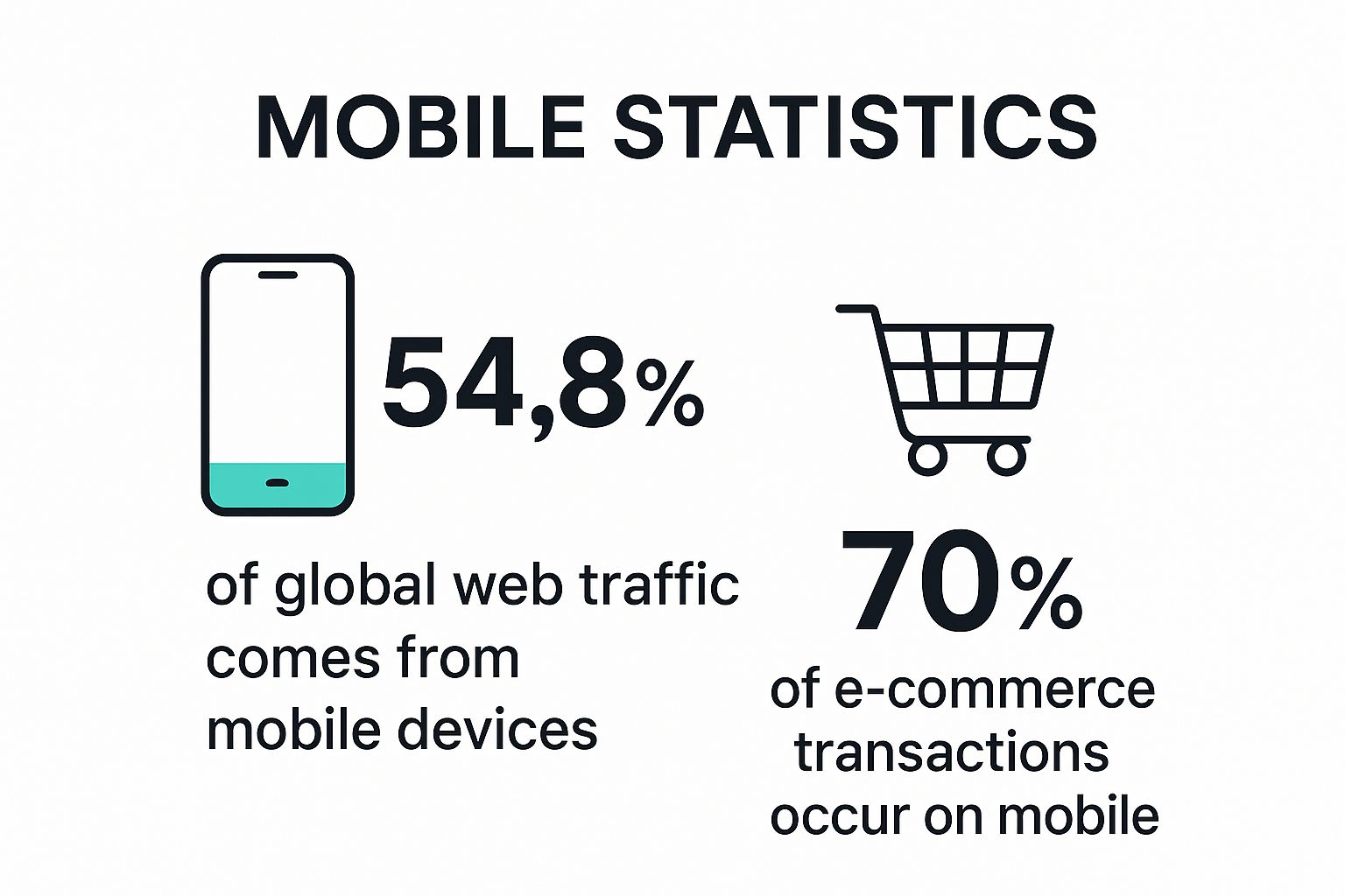
The infographic above highlights the staggering statistic that over 55% of global web traffic originates from mobile devices. This underscores why responsive design is crucial for anyone seeking a strong online presence. If your website isn't optimized for mobile, you're potentially alienating over half of your potential customers. For local businesses, restaurants, real estate agents, e-commerce startups, and any other organization relying on web traffic, ignoring this mobile majority is simply not an option.
This dominance of mobile usage is precisely why responsive design deserves its top spot on this list. For small business owners, real estate agents, restaurant owners, and entrepreneurs – essentially anyone targeting consumers – capturing this mobile audience is critical. A website that doesn't display or function well on mobile devices will lead to high bounce rates, frustrated users, and lost business opportunities.
Features and Benefits of Responsive Design:
- Automatic Layout Adjustment: Content and elements rearrange themselves dynamically to fit any screen size and orientation, eliminating the need for horizontal scrolling or zooming.
- Content Prioritization: Essential information is displayed prominently on smaller screens, ensuring users see the most important content first.
- Consistent Functionality: Interactive elements, forms, and other functionalities work smoothly across all devices, maintaining a positive user experience.
Pros:
- Captures the Growing Mobile Audience: Reach and engage the majority of internet users who are accessing content on mobile.
- Reduces Bounce Rates: A positive mobile experience encourages users to stay longer on your site, exploring your content and offerings.
- Future-Proofs Websites: As mobile usage continues to grow and evolve, a responsive design ensures your site remains accessible and effective.
Cons:
- Initial Development Time: Implementing responsive design can sometimes require more upfront development time compared to creating separate mobile and desktop versions.
- Complex Layout Optimization: Highly complex layouts may present challenges in ensuring optimal display across all screen sizes, requiring careful planning and testing.
Examples of Successful Responsive Design:
- Amazon: Seamlessly transitions from desktop to mobile, providing a consistent shopping experience. (www.amazon.com)
- The New York Times: Maintains readability and navigability across a wide range of devices. (www.nytimes.com)
- Airbnb: Offers an intuitive booking experience regardless of whether users are on their desktop or mobile phone. (www.airbnb.com)
Tips for Implementing Responsive Design:
- Mobile-First Approach: Design with the smallest screen in mind first, then progressively enhance for larger displays.
- Real Device Testing: Test your website on a variety of actual mobile devices to ensure accurate rendering and functionality, rather than relying solely on browser emulators.
- Touch-Friendly Navigation: Prioritize intuitive, touch-friendly navigation elements for mobile users, such as larger buttons and simplified menus.
By prioritizing responsive design, businesses can effectively tap into the dominant mobile market, enhance user experience, and ultimately drive better results. It's a vital investment for any organization seeking to thrive in the mobile-first digital era.
2. Improved User Experience
Responsive design is crucial for creating a positive user experience, a key factor influencing why it's so important in today's digital landscape. It eliminates the frustration of zooming, pinching, and incessant horizontal scrolling that plagues users on non-responsive sites when viewed on mobile devices. Instead, content reflows and adapts to any screen size, presenting information in a logical, easily navigable format. This seamless experience leads to increased user satisfaction and encourages visitors to engage more deeply with the website's content and offerings.

A core aspect of user experience is accessibility across devices. This means ensuring your website adapts seamlessly to different screen sizes and resolutions. For a deeper dive into building accessible sites, explore this helpful resource on creating a mobile-friendly website. Responsive design achieves this by adjusting elements like text size, navigation menus, and image dimensions to fit the screen perfectly. Features like readable text without zooming, appropriately sized navigation elements, properly spaced touch targets (crucial for mobile users), and optimized image and media display all contribute to a smooth, intuitive experience. Learn more about Improved User Experience
Think of popular websites like Etsy. Their responsive design makes browsing thousands of handcrafted products enjoyable on any device, whether it's a large desktop monitor or a small smartphone screen. Similarly, Dropbox's clean and simple interface scales elegantly across different screen sizes, maintaining its user-friendliness regardless of the device used. BBC News offers another excellent example, demonstrating how content hierarchy can be prioritized differently based on the device while maintaining a consistent brand identity. Why is responsive design important for these companies? Because it directly impacts user engagement and ultimately, their bottom line.
While responsive design offers numerous benefits, including reduced user frustration, increased time spent on site, improved conversion rates, and enhanced accessibility, there are a few potential drawbacks to consider. Sometimes, a responsive design can lead to a simplified experience compared to designs specifically tailored for individual devices. It also requires careful planning of content hierarchy to ensure that important information is displayed prominently on all screen sizes.
To implement effective responsive design, consider these practical tips:
- Use appropriate font sizes: A minimum of 16px for body text is recommended for comfortable reading.
- Ensure touch targets: These should be at least 44×44 pixels to prevent accidental clicks or taps.
- Implement logical tab order: This is essential for users navigating with a keyboard.
- Test user flows: Rigorous testing on multiple devices is crucial to identify and address any usability issues.
The concept of responsive web design, crucial to understanding why it is so important, was popularized by individuals like Luke Wroblewski, a strong advocate of Mobile First design, and Ethan Marcotte, who coined the term "responsive web design." Their work highlighted the importance of designing for the user, regardless of the device they choose. By prioritizing user experience, responsive design significantly contributes to the success of any website.
3. SEO Benefits
In today's digital landscape, a strong online presence is crucial for business success, and search engine optimization (SEO) plays a vital role in achieving that. Responsive design significantly impacts your website's SEO performance, influencing how easily search engines can discover, index, and rank your site. Search engines like Google prioritize mobile-friendly websites, and responsive design is their recommended approach for mobile optimization. This is largely due to Google's mobile-first indexing, implemented in 2018, which means Google primarily uses the mobile version of your website's content for indexing and ranking. This makes responsive design a critical factor in determining your website's visibility in search results. Therefore, understanding and leveraging responsive design is essential for anyone seeking to improve their online visibility and attract more organic traffic.

Responsive design offers several key features that benefit SEO. First, it utilizes a single URL for all devices, eliminating duplicate content issues that can arise from having separate mobile and desktop versions of your site. This simplifies indexing and improves link equity, as all link juice is consolidated to one URL. Second, responsive websites, when implemented correctly, generally load faster on all devices due to optimized code and resources. Page speed is a crucial ranking factor, impacting both user experience and search engine visibility. Third, a single, responsive website makes it easier for search engine crawlers to access and index your content efficiently, maximizing your crawl budget utilization.
The benefits of these features translate to higher search engine rankings, increased organic traffic, and better link equity. You avoid splitting your link equity between mobile and desktop versions, concentrating its power for improved ranking potential. Case studies abound, showcasing the positive impact of responsive design on SEO. The Guardian, for example, saw a 44% increase in mobile traffic after implementing responsive design. Similarly, Skinny Ties experienced a remarkable 377.6% increase in revenue from iPhones after going responsive.
However, responsive design is not without its challenges. It requires careful implementation to maintain optimal page speed. Overly complex designs or inefficient code can negate the speed benefits. It's also important to remember that responsive design is not a complete SEO solution in itself. It needs to be combined with other SEO best practices like keyword research, content optimization, and link building for maximum effectiveness.
To ensure your responsive website is fully optimized for search engines, follow these tips: Use structured data markup regardless of device to help search engines understand your content; ensure the same content is available on mobile and desktop versions; optimize images with the srcset attribute for different resolutions to improve loading times; and implement lazy loading for images to further enhance page speed. These optimizations, combined with a responsive design, create a powerful foundation for improved SEO performance. Influential figures like Google's John Mueller and leading SEO platforms like Moz and SEMrush have long championed the importance of responsive design for SEO, reinforcing its value in the digital marketing landscape.
Learn more about SEO Benefits This is especially important for small business owners, real estate agents, restaurant owners, entrepreneurs, and local businesses—anyone aiming to boost their online visibility and attract more customers. By embracing responsive design, you not only improve user experience but also significantly enhance your chances of ranking higher in search results and reaching a wider audience.
4. Cost and Time Efficiency
In the realm of web development, responsive design plays a crucial role in optimizing both cost and time efficiency. This approach is a cornerstone of modern web development and a significant reason why responsive design is so important, particularly for budget-conscious small business owners, entrepreneurs, and startups. Maintaining a single responsive website is drastically more efficient than juggling separate websites or apps for mobile and desktop users. This consolidated approach streamlines development, testing, and ongoing maintenance, ultimately saving you valuable time and money while ensuring consistent user experiences across all devices.
So, how does it work? Responsive design employs a single codebase that adapts fluidly to various screen sizes and resolutions. This adaptability is achieved through flexible grids, images, and CSS media queries that adjust the layout and content presentation based on the user's device. Instead of developing separate sites for desktop computers, tablets, and smartphones, you maintain one site that caters to all, automatically adjusting to provide an optimal viewing experience.
Features of a Responsive Design Approach:
- Single codebase for all devices: This eliminates the need for separate development efforts for different platforms, simplifying updates and maintenance.
- Unified content management: Managing content becomes significantly easier with a single website. Updates are reflected across all devices simultaneously.
- Streamlined testing processes: Testing is consolidated to a single website, simplifying quality assurance and reducing the chance of platform-specific bugs.
- Centralized analytics and tracking: Website performance data is collected in one place, providing a holistic view of user behavior and simplifying analysis.
Pros:
- Lower development costs: Building one site is inherently less expensive than building two or more.
- Reduced maintenance overhead: Updates and bug fixes only need to be applied once, reducing ongoing costs.
- Faster implementation of updates and features: Deployments are streamlined as changes are applied universally.
- Simplified content management workflow: Managing content in a single location saves time and reduces the risk of inconsistencies.
Cons:
- Initial responsive implementation may cost more than a basic desktop-only site: While long-term costs are lower, the initial investment for a complex responsive site can be higher than a simple desktop site.
- Complex responsive sites require more specialized developer skills: Developing effective responsive websites requires a deeper understanding of responsive techniques and frameworks.
Real-World Examples of Successful Responsive Implementations:
- Microsoft: Their shift to responsive design reportedly reduced their development costs by approximately 30%.
- The Boston Globe: A responsive redesign eliminated the need for separate platform-specific teams, streamlining their workflow.
- O'Reilly Media: Consolidating multiple sites into one responsive platform resulted in an impressive 80% reduction in maintenance costs.
Actionable Tips for Implementing Responsive Design:
- Utilize CSS Frameworks: Leverage frameworks like Bootstrap or Foundation to expedite development and ensure responsiveness.
- Component-Based Design: Implement a component-based design system to maintain consistency and streamline updates across the site.
- Progressive Enhancement: Start with a core experience that works on all devices, then progressively enhance features for more capable browsers and devices.
- Automated Testing: Employ automated testing tools to ensure consistent functionality across multiple viewports and devices.
When and Why to Use a Responsive Approach:
Responsive design is the recommended approach for almost all new website projects today. It's especially beneficial for:
- Small businesses with limited budgets: Responsive design offers the most cost-effective way to reach a broad audience.
- E-commerce startups: Providing a seamless shopping experience across all devices is crucial for maximizing conversions.
- Local businesses: Reaching local customers on their mobile devices is essential for driving foot traffic.
- Nonprofits and community organizations: Responsive design ensures accessibility for all members of the community.
- Service-based businesses: Making it easy for potential clients to contact you from any device is vital for lead generation.
Responsive design, popularized by web standards advocates like Jeffrey Zeldman and facilitated by frameworks like Bootstrap (developed by Twitter) and Foundation (developed by ZURB), is a crucial investment for any business seeking a strong and cost-effective online presence. It’s not just a trend; it's a fundamental best practice in modern web development and a key factor in a successful online strategy.
5. Future-Proofing Websites
In the fast-paced world of technology, ensuring your website remains relevant and functional across a constantly evolving landscape of devices is crucial. This is where responsive design shines, earning its place as a critical element in modern web development. Responsive design principles prepare your website for the future, allowing it to adapt seamlessly to new devices and screen sizes without requiring costly and time-consuming redesigns. This makes it a sustainable, long-term approach to web development, vital for anyone asking "why is responsive design important?".
Responsive design works by utilizing a combination of flexible layouts, images, and cascading style sheets (CSS) media queries. Instead of creating fixed-width layouts designed for specific screen sizes, responsive design employs:
- Fluid grid layouts: These layouts adapt to any screen size, proportionally resizing content to fit the available space.
- Flexible images and media: Images and videos resize dynamically, preventing them from overflowing their containers or appearing disproportionately large on smaller screens.
- CSS media queries: These rules target specific device characteristics, such as screen width, resolution, and orientation, allowing developers to tailor the presentation of content based on the device being used. This means a website can look and function differently on a smartphone compared to a desktop, optimizing the user experience for each.
- Device-agnostic approach: This forward-thinking strategy focuses on designing for the capabilities of a device rather than its specific make and model. This ensures compatibility with a broader range of current and future devices.
This combination of features allows a single website to adapt to a multitude of devices, from smartwatches to large-screen TVs, and everything in between.
Examples of Successful Implementation:
- CSS Zen Garden: This classic website showcases the power of CSS and responsive design, demonstrating how different styles can be applied to the same HTML structure, creating vastly different visual presentations.
- GOV.UK: The UK government website exemplifies a successful responsive approach, seamlessly accommodating numerous device trends since its launch.
- Smashing Magazine: This popular web design and development resource has embraced responsive design, allowing its site to evolve gradually without requiring major overhauls.
Pros:
- Adapts to new devices as they enter the market: You won't need to scramble to rebuild your website every time a new phone, tablet, or other device emerges.
- Reduces need for major redesigns when technology changes: Responsive design minimizes the need for costly and disruptive website overhauls.
- Provides consistent experience as users move between devices: A user starting their browsing journey on a smartphone and continuing on a desktop will have a smooth and consistent experience.
- Accommodates future browser capabilities: As browsers evolve, responsive design ensures your website remains compatible and functional.
Cons:
- May require occasional updates to address new device categories: While responsive design minimizes redesign needs, some updates may be necessary to handle entirely new device categories with unique characteristics.
- Can't always anticipate all future technological changes: While responsive design is future-oriented, it’s impossible to predict every future technological advancement. Occasional adjustments might still be needed.
Tips for Implementing Responsive Design:
- Use relative units (%, em, rem) instead of fixed pixels: This allows content to scale proportionally to the screen size.
- Implement feature detection rather than device detection: Focus on what a device can do instead of what it is, ensuring broader compatibility.
- Design components that can function in multiple contexts: Create modular design elements that can be rearranged and resized to fit different screen sizes and orientations.
- Follow web standards and accessibility guidelines: Ensure your website is accessible to users with disabilities and conforms to best practices.
Popularized By:
Key figures who have championed responsive web design include Ethan Marcotte (author of Responsive Web Design), Rachel Andrew (CSS Grid advocate), and Jen Simmons (advocate for intrinsic web design).
For small business owners, real estate agents, restaurant owners, entrepreneurs, and anyone seeking a strong and sustainable online presence, responsive design is no longer a luxury but a necessity. It's a crucial investment in the future of your website, ensuring it remains accessible, functional, and effective in reaching your target audience regardless of how they choose to access it. It's a core reason why responsive design is so important in today's digital landscape.
6. Improved Conversion Rates
When discussing why responsive design is important, the impact on conversion rates is a crucial factor, especially for businesses focused on generating leads, sales, or engagement. A responsive website adapts seamlessly to any screen size, ensuring a consistent and user-friendly experience whether visitors are browsing on a desktop, laptop, tablet, or smartphone. This directly translates to improved conversion rates across all devices. Why? Because when users can easily navigate your site, find the information they need, and complete desired actions (like making a purchase, filling out a form, or consuming content), they are significantly more likely to convert. This positive impact ripples through your business goals and ultimately affects your ROI.
A responsive design achieves this by incorporating features like optimized call-to-action (CTA) buttons that resize appropriately for different screen sizes, simplified checkout processes specifically designed for mobile users, and accessible forms that function flawlessly across all devices. Maintaining consistent branding and user flows across platforms further reinforces a positive user experience, encouraging visitors to complete desired actions.
The pros of a responsive design for conversions are numerous: higher completion rates for forms and transactions, reduced cart abandonment on mobile devices (a common pain point for e-commerce businesses), increased lead generation across various platforms, and a better return on investment (ROI) for your marketing campaigns. For example, Walmart saw a 20% increase in conversions after implementing responsive design, demonstrating the significant impact it can have on a large scale. Similarly, Offspring experienced a 15.19% increase in conversion rate with their responsive site, and O'Neill Clothing saw a staggering 407.25% increase in tablet conversions after going responsive. These real-world examples highlight the potential for dramatic improvements in conversion rates across diverse industries.
However, it's important to acknowledge the ongoing commitment required to maintain a high-performing responsive website. It necessitates continuous optimization and testing to ensure optimal performance across all devices. Conversion elements, in particular, need careful adaptation for different contexts to remain effective. For instance, a large CTA button that works well on a desktop might overwhelm a smaller mobile screen.
For businesses aiming to maximize their online success, responsive design isn't just a nice-to-have; it's a necessity. Whether you're a small business owner, a real estate agent, a restaurant owner, an e-commerce startup, a home service business, a local nonprofit, a healthcare provider, or any other type of organization, a responsive website is essential for reaching your target audience effectively and driving conversions. Learn more about Improved Conversion Rates to further understand how to optimize your sales funnel.
To ensure your responsive design contributes to higher conversion rates, consider these actionable tips:
- A/B test critical conversion elements across devices: This allows you to identify what works best for each platform and optimize accordingly.
- Ensure forms are simple and easy to complete on mobile: Minimize required fields and use appropriate keyboard types for mobile form inputs (email, phone, etc.).
- Optimize page load speed, especially for checkout pages: Slow loading times can lead to frustration and abandoned carts.
- Use appropriate keyboard types for mobile form inputs (email, phone, etc.): This makes it easier for users to fill out forms quickly and accurately on mobile.
By understanding the importance of responsive design for improved conversion rates and implementing these best practices, you can create a website that effectively engages your audience, drives conversions, and ultimately achieves your business objectives. This is particularly crucial in today's mobile-first world where users expect seamless experiences across all their devices. Why is responsive design important? Because it's directly tied to your bottom line.
7. Social Media Integration
In today's interconnected world, social media is a powerhouse for driving traffic and building brand awareness. Understanding why responsive design is important means understanding how it impacts your social media strategy. With over 4.5 billion social media users worldwide, a significant portion of whom access these platforms primarily through mobile devices, responsive design is crucial for maximizing your social media marketing effectiveness. It ensures that the content you share on platforms like Facebook, Twitter, Instagram, and LinkedIn directs users to a website that functions flawlessly on any device, creating a seamless transition from social platform to your online presence. This is especially important for target audiences like small business owners, real estate agents, restaurant owners, entrepreneurs, and local businesses who rely heavily on social media to reach their customers.
How it Works:
Responsive design adapts your website's layout and content to fit the screen size and orientation of the user's device. When someone clicks a link shared on social media, responsive design guarantees they'll land on a page optimized for their mobile phone, tablet, or desktop computer. This improves user experience and encourages visitors to explore further.
Features of Effective Social Media Integration with Responsive Design:
- Properly formatted social sharing previews: These previews, often including an image, title, and short description, entice users to click and are crucial for first impressions.
- Optimized social media cards and meta tags: Open Graph and Twitter Cards allow you to customize the information displayed in social media previews, controlling the narrative and enhancing visibility.
- Consistent experience between social apps and websites: Maintaining a cohesive brand identity and user experience across platforms builds trust and reinforces your brand message.
- Mobile-friendly embedding of social content: Seamlessly integrate social feeds and widgets onto your website while ensuring they display correctly on all devices.
Pros:
- Higher engagement from social media traffic: Users are more likely to engage with content on a site that is easy to navigate and read on their device. This is critical for non-tech savvy business owners and those new to digital marketing.
- Improved social sharing of website content: A positive user experience encourages visitors to share your content with their own networks, expanding your reach organically.
- Better brand consistency across platforms: Presenting a unified brand image strengthens your identity and builds credibility.
- Enhanced social media marketing ROI: By driving more qualified traffic and improving engagement, responsive design contributes to a greater return on your social media marketing investment. This is particularly valuable for e-commerce startups and service-based businesses looking to maximize their marketing spend.
Cons:
- Social platforms frequently update their sharing formats: Keeping up with these changes requires ongoing adjustments to your website's meta tags and sharing previews.
- Different social platforms may display shared content differently: Tailoring your content strategy for each platform is essential to ensure optimal presentation.
Examples of Successful Implementation:
- BuzzFeed: Known for highly shareable content, BuzzFeed's responsive design ensures their articles and quizzes look great and function perfectly across all devices and platforms.
- National Geographic: Their visually rich website maintains its impact when shared on social media thanks to responsive design, crucial for engaging their audience with stunning photography and immersive storytelling.
- Medium: The article format transitions seamlessly from social preview to full reading experience, providing a consistent and enjoyable user experience.
Actionable Tips:
- Implement proper Open Graph and Twitter Card meta tags: This allows you to control how your content appears when shared.
- Ensure shared images are optimized for different platforms: Use appropriate image sizes and formats for each social network.
- Test social sharing across various platforms and devices: Verify that your content displays correctly and functions as expected on different phones, tablets, and desktops.
- Consider AMP (Accelerated Mobile Pages) for content frequently shared on social media: AMP can significantly improve loading speed on mobile devices, leading to a better user experience.
Why This Deserves Its Place in the List:
In a mobile-first world, social media integration and responsive design go hand-in-hand. For any business, particularly those targeting local markets and relying on online visibility, ignoring responsive design means missing out on a significant portion of potential customers and hindering your social media marketing efforts. By ensuring a smooth and engaging experience for users arriving from social platforms, responsive design strengthens your online presence, boosts brand awareness, and drives conversions. This is why it's a fundamental element of any successful digital strategy, especially for small business owners, local nonprofits, healthcare providers, and anyone seeking a strong online presence. The influence of major platforms like Facebook (with its mobile-first strategy), Twitter (with its responsive web app), and Pinterest (with its highly visual responsive design) underscores the importance of this approach.
7 Key Reasons for Responsive Design
| Reason | Implementation Complexity 🔄 | Resource Requirements ⚡ | Expected Outcomes 📊 | Ideal Use Cases 💡 | Key Advantages ⭐ |
|---|---|---|---|---|---|
| Mobile Usage Dominance | Medium – requires careful responsive layouts for varied screens | Moderate – development time higher than basic site | Increased mobile traffic, reduced bounce rates, future-proofing | Websites with high mobile user base | Captures growing mobile audience; ensures seamless multi-device use |
| Improved User Experience | Medium – requires thoughtful content hierarchy and UX design | Moderate – testing on multiple devices needed | Higher user satisfaction, longer site visits, better engagement | Sites prioritizing usability and accessibility | Reduces user frustration; enhances accessibility and engagement |
| SEO Benefits | Medium – careful speed and content parity needed | Low to Moderate – focus on optimization | Higher search rankings, increased organic traffic | Sites targeting better visibility and traffic | Single URL avoids duplicate content; boosts organic reach |
| Cost and Time Efficiency | Medium – initial cost possibly higher; complex sites need skills | Moderate – uses single codebase and unified management | Lower development & maintenance costs, faster updates | Enterprises managing multi-platform presence | Reduces overhead; simplifies workflows and testing |
| Future-Proofing Websites | Medium – needs ongoing updates for new devices | Moderate – requires adaptive design principles | Longevity across device types, fewer major redesigns | Long-term projects expecting evolving device landscape | Accommodates new devices; sustainable web design |
| Improved Conversion Rates | Medium to High – continuous optimization required | Moderate – resources for A/B testing and UX tuning | Higher form completions and purchases; better ROI | E-commerce and lead generation sites | Increases conversions; reduces cart abandonment |
| Social Media Integration | Medium – requires updates as social platforms evolve | Moderate – ongoing meta tag and format management | Higher social engagement and sharing; consistent brand image | Content-heavy sites relying on social traffic | Boosts social engagement; ensures proper content display on social |
Embrace the Future with Responsive Design
In today's mobile-first world, understanding why responsive design is important is crucial for online success. We've explored how responsive design enhances user experience by seamlessly adapting to any device, boosting SEO rankings, saving time and money by consolidating development efforts, and future-proofing your online presence. From improved conversion rates to seamless social media integration, the benefits are undeniable. Mastering these concepts, particularly for small businesses, real estate agents, restaurants, entrepreneurs, and local service providers, translates directly to a stronger online presence, wider reach, and increased engagement with your target audience. Why is responsive design important? Because it empowers you to connect with customers wherever they are, on whatever device they choose, providing a consistent and positive brand experience. This is essential for staying competitive and thriving in the evolving digital landscape.
Are you ready to harness the power of responsive design and elevate your online presence? Swish Web Designs specializes in crafting responsive, SEO-optimized websites for businesses just like yours. Visit Swish Web Designs today to learn more about how we can help you create a dynamic and effective website that reaches your target audience and drives growth.
Article created using Outrank


